
Most traders watch the index. They watch the S&P 500 print a green candle and feel good, or a red one and feel bad, as if the market were one single thing that goes up or down. It isn't. The index is an average — a crowd of eleven very different groups of stocks, and on any given day some of those groups are being aggressively bought while others are being quietly dumped. The average can look flat while an enormous amount of money changes seats underneath it.
That movement of money from one group of stocks to another is called sector rotation, and learning to see it is one of the highest-leverage skills in top-down trading. It answers the single most important question in the Hollow Point Trading process: is money rotating INTO this group, or out of it? Get that right and you're trading with the current. Get it wrong and you're the person buying a beautiful chart that the smart money is done with.
This guide is the complete playbook — not a summary, the whole thing. We'll define what sectors are, why they move in a predictable sequence tied to the economy, how to read the flow with ratio charts, how the picture changes in trending versus choppy versus high-volatility markets, how to stack it across timeframes, how it braids together with the rest of your toolkit, and exactly how it plugs into the macro→sector→stock funnel. We'll walk through worked examples with real numbers, catalog the mistakes that quietly bleed accounts, separate how professionals use this from how beginners misuse it, and finish with a cheat-sheet you can pin to the wall. By the end you'll be able to open a chart Monday morning and answer, with evidence, where the money is going.
The Concept: The Market Is Eleven Markets
Every large U.S. stock is filed into one of eleven official buckets under a system called GICS — the Global Industry Classification Standard. You don't need to memorize the acronym; you need to know the eleven groups and, crucially, what each one is underneath the label. Each has a liquid ETF (a single tradable symbol that holds the whole basket), and those ticker symbols are the language of rotation:
- Technology (XLK) — software, chips, hardware. The growth engine.
- Consumer Discretionary (XLY) — the stuff people buy when they feel rich: cars, travel, restaurants, Amazon, Tesla, retail.
- Communication Services (XLC) — Meta, Google, Netflix, telecom. Half growth, half utility.
- Financials (XLF) — banks, insurers, payment networks. Loves a steepening yield curve.
- Industrials (XLI) — machinery, defense, railroads, airlines. The real economy's muscle.
- Materials (XLB) — chemicals, metals, miners, packaging. Raw inputs.
- Energy (XLE) — oil, gas, drillers. Marches to commodity prices and inflation.
- Consumer Staples (XLP) — the stuff people buy no matter what: toothpaste, soda, groceries.
- Utilities (XLU) — power and water companies. Bond-like, boring, defensive.
- Health Care (XLV) — drugs, devices, insurers. Half defensive, half growth.
- Real Estate (XLRE) — REITs, property. Rate-sensitive.
Not all eleven are the same size
Before we go further, one fact that changes how you weight everything: these sectors are wildly different in size, and the index is capitalization-weighted, which means a handful of them are the index. In a typical modern SPY, Technology alone is roughly 30% of the whole thing. Add Communication Services (which is really Google and Meta, growth stocks wearing a telecom costume) and Consumer Discretionary (which is heavily Amazon and Tesla), and those three "offense" groups can be 55–60% of the entire S&P 500.
Why does that matter? Because it tells you which rotations move the index and which rotations happen quietly underneath it. When XLK rotates, SPY moves — they're practically joined at the hip. When XLU (2–3% of the index) or XLB (2%) rotates, the index barely notices, which is exactly why those small defensive groups are such clean, uncontaminated signals. Money hiding in Utilities isn't big enough to hold the index up, so the index keeps grinding higher on the back of a few mega-cap Tech names while the breadth underneath rots. That divergence — index up, defensives quietly leading — is one of the most valuable warnings you'll ever get, and you only see it if you're watching the small sectors that don't move the average.
So keep two lists in your head: the heavyweights (XLK, XLC, XLY, XLF) that drive the tape, and the tells (XLU, XLP, XLB, XLE) that are too small to drive it but honest enough to warn you.
The two teams: offense and defense
Here's the first mental model that changes everything. Divide those eleven into two teams.
Offense is the group that leads when investors are confident, when they want growth and are willing to take risk. That's Technology (XLK) and Consumer Discretionary (XLY) above all — plus the more aggressive slices of Industrials, Financials, and Materials. When offense leads, the market is saying the future is bright, put me in risk.
Defense is where money hides when investors get nervous. That's Utilities (XLU), Consumer Staples (XLP), and Health Care (XLV) — the sectors whose earnings barely flinch in a recession because people keep paying their electric bill, brushing their teeth, and taking their medicine no matter what the economy does.
The single most useful sentence in this entire guide: when offense leads, risk is ON; when defense leads, risk is OFF. You can learn a tremendous amount about the market's real mood — not what the headline index shows, but what money is actually doing — just by asking which team is winning this week. A market grinding to new highs while Utilities and Staples quietly outperform Tech is a market whose leadership is rotting from the inside. That's a warning the index itself will not give you until it's too late.
The middle sectors, and why "half" matters
Notice that a few sectors got the word "half" attached: Communication Services is half growth and half utility, Health Care is half defensive and half growth, Industrials straddle the cycle. This isn't hedging — it's the truth, and it's useful. These swing sectors are the ones whose character changes depending on which side of them is leading.
Take Health Care. When the growth half (biotech, medical devices, tools) is what's outperforming, XLV is behaving like offense — the market is confident and paying up for innovation. When the defensive half (big pharma, managed care, dividend-paying drugmakers) is what's leading, XLV is behaving like a bunker. Same ETF, opposite message. The way you read this without dissecting holdings all day: watch XLV relative to a clearly-defensive sector like Staples. If XLV/XLP is rising, the offensive half of Health Care is in charge and the world is fine. If XLV/XLP is falling while both outperform SPY, money is fleeing toward the most defensive corner it can find — a deeper risk-off than a glance at XLV alone would show. The swing sectors reward you for reading them as spectrums, not switches.
Growth versus value is the same story in different clothes
You'll hear "growth is leading" or "value is rotating" constantly, and it's worth knowing that this is sector rotation described from a different angle. Growth is concentrated in Tech, Communications, and Discretionary — the offense. Value lives in Financials, Energy, Industrials, and Materials — the more cyclical, economically-sensitive names, plus the defensives. When someone says "the market rotated from growth to value today," what they mean in your language is offense sold, cyclicals and defensives bid. You can watch it directly with a ratio: IWF/IWD (growth ETF over value ETF), or more simply XLK/XLF. When that line rolls over, the same rotation showing up in the sector ratios is showing up in the style ratios. Two windows onto one flow.
The Mechanism: Why Sectors Rotate in a Sequence
Rotation isn't random. It follows the business cycle — the economy's slow, repeating rhythm of expansion and contraction. And it follows it in a predictable order, because different businesses make money at different points in that rhythm. This is the engine under the whole thing, so we'll build it up piece by piece.
The economy breathes in roughly four phases. Think of it as a year with seasons.
Early cycle — the recovery
Early cycle is the recovery — the economy is climbing out of a recession. The central bank (the Federal Reserve) has cut interest rates to the floor to stimulate borrowing. Credit is cheap, activity is accelerating from a low base, and everyone can smell growth coming. This is the sweet spot for the most economically-sensitive, rate-sensitive groups: Consumer Discretionary (XLY) roars because cheap loans mean people buy cars and houses again. Financials (XLF) benefit because banks lend into recovery. Real Estate (XLRE) and Industrials (XLI) turn up as building and production restart. This is typically the strongest phase for the stock market as a whole — the biggest, fastest gains come off the bottom.
The intuition to hold onto: in early cycle, the sectors that were most punished in the recession snap back hardest, because they were priced for the world to end and the world didn't end. Discretionary and Financials and small-caps lead not because they're the best businesses but because the fear discount unwinds violently. This is why early-cycle rallies feel so ferocious and so uncomfortable — the leadership is exactly the stuff everyone hated three months earlier.
Mid cycle — the long middle
Mid cycle is the long, healthy middle of the expansion. Growth is solid and steady, not accelerating. This is usually the longest phase and the hardest to trade with rotation alone because leadership gets murky and rolls between groups. Technology (XLK) tends to shine here — confident companies invest in equipment and software, and the growth story is in full swing. Momentum broadens out.
Mid cycle is where most traders spend most of their careers, and it's the phase where the tidy textbook running order helps you least. Leadership doesn't hand off cleanly; it sloshes. Tech leads for two months, then Industrials catch a bid on a manufacturing uptick, then Tech again. The honest read of mid cycle is often "no dominant rotation right now," and — this matters — that itself is the signal. When rotation goes quiet and every ratio looks like static, the edge isn't in the rotation, it's in individual stock selection and other tools. Don't manufacture a rotation thesis in the mush.
Late cycle — the top
Late cycle is the top. The economy is running hot, unemployment is low, and — the key signal — inflation is rising. The Fed starts raising rates to cool things down. Now the groups that thrive on inflation and hard assets take the baton: Energy (XLE) and Materials (XLB) lead as commodity prices climb. This is the tell. When energy and materials are the strongest sectors and defensives are starting to perk up, the party is getting late, and smart money begins rotating toward safety even while the index is still making highs.
Late cycle is the most profitable to read correctly and the most dangerous to read late, because it's the phase that ends in a bear market. The characteristic tell is a split personality in the tape: Energy and Materials — real, hard, inflation-loving assets — leading on one side, and Utilities and Staples starting to firm up on the other, with the flashy growth names quietly losing relative strength in the middle. Two very different kinds of money are getting cautious at once (the inflation hedgers and the safety seekers), and the only thing still holding the index up is the last of the momentum crowd in a handful of mega-caps. When you see hard assets and bond-proxies both outperforming while Tech fades, the clock is late.
Recession — the contraction
Recession is the contraction. Growth turns negative, earnings fall, fear dominates. Money crowds into the sectors that survive anything: Utilities (XLU), Consumer Staples (XLP), and Health Care (XLV) — defense, full stop. They still go down in absolute terms, usually, but they go down less, and in a bear market losing less is winning.
Then rates get cut, the cycle bottoms, and early-cycle offense takes the lead again. Round and round.
The part that actually matters to a trader
Here's the beautiful part, and the reason this matters for a trader rather than an economist: the rotation happens before the economic data confirms it. Markets are discounting machines — they price the future, six to nine months out. So Consumer Discretionary starts outperforming while the news is still full of recession. Energy starts leading while everyone's still celebrating growth. The rotation is the market voting on what comes next, in real time, with real money. You don't need to forecast the economy. You need to read the vote.
A simplified running order you can hang on the wall: early cycle → Discretionary, Financials, Real Estate, Industrials. Mid cycle → Technology. Late cycle → Energy, Materials. Recession → Staples, Utilities, Health Care. It's not a law of physics — no two cycles are identical, the Fed intervenes, shocks happen — but it's a remarkably durable map, and it gives you a thesis to test against the tape instead of a blank chart.
A worked cycle, start to finish
Let it run once as a story so the sequence sticks. Imagine the economy just bottomed after a rough recession. Rates have been cut to near zero. The first thing you notice on your ratio screen isn't in the news yet: XLY/SPY (Discretionary vs market) quietly stops making lower lows and starts curling up, and XLF/SPY follows a few weeks later. The headlines are still gloomy; unemployment is still high. But Discretionary and Financials are already outperforming — the market is voting for recovery. You buy the strongest homebuilder and the strongest regional bank, not because you forecast anything, but because the ratios turned.
Six months on, the recovery is undeniable, and now XLK/SPY takes over as the dominant rising ratio while Discretionary's relative lead flattens. You rotate your attention to Tech; the expansion has moved into its long middle. A year or more after that, you notice XLE/SPY and XLB/SPY — energy and materials, dormant for the whole expansion — start grinding higher, and the CPI headlines are getting hot. That's your late-cycle bell. When, on top of that, XLU/SPY and XLP/SPY also start to firm while XLK/SPY finally rolls under its 55-EMA, you've watched the full handoff: offense → hard assets → defense. You didn't predict a single macro number. You read four ratio lines and let them tell you which phase you were standing in. That is the entire skill, run once.
How to Read It: Relative Strength and the Ratio Chart
Everything above is theory until you can see it. The tool that makes rotation visible is the ratio chart, and it's the most underused chart in retail trading.
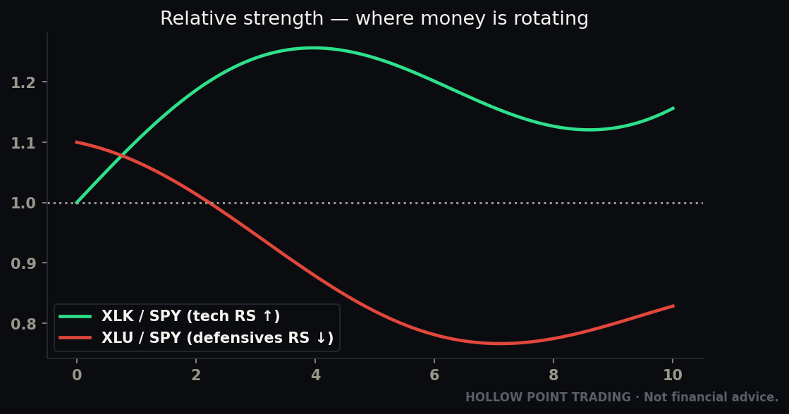
A ratio chart divides one symbol by another and plots the result: XLK/SPY, for example. You're not asking "is Tech going up?" You're asking the far more useful question: "is Tech going up FASTER than the market?" That's relative strength — performance measured against a benchmark, not against zero.
Why does this matter so much? Because in a bull market almost everything goes up, and in a bear market almost everything goes down. Absolute price tells you the tide. The ratio tells you which boats the money is actually choosing. A stock can be green on the day and losing relative strength — drifting down against its sector while the sector rips. That stock is a laggard wearing a green disguise.
One clarification that saves confusion
"Relative strength" here means relative to a benchmark — the ratio line. Don't confuse it with RSI, the Relative Strength Index, which is a momentum oscillator measuring a single instrument against its own recent history. They share a word and nothing else. When this guide says relative strength, it always means the ratio: this thing versus that thing, who's winning. We'll actually put RSI on a ratio chart later, which makes the naming collision even funnier, but keep the two ideas separate in your head.
How to build one, concretely
In your charting platform, type the division directly into the symbol box: XLK/SPY. The line that appears is the ratio. When the line is rising, the numerator (XLK) is outperforming the denominator (SPY) — money is flowing IN relative to the market. When the line is falling, XLK is underperforming — money is flowing OUT relative to the market. Flat means it's moving in line with the market, no edge either way.
That's the entire secret. Rising ratio = inflow of relative strength. Falling ratio = outflow. You are literally watching the money choose sides.
A couple of practical notes so your ratios are honest. First, the absolute number on a ratio chart is meaningless — XLK/SPY reading 0.31 versus 0.34 tells you nothing on its own; only the direction and trend matter. Don't anchor to the value; read the slope. Second, be deliberate about your denominator. SECTOR/SPY answers "is this sector beating the market?" But you can ask sharper questions by changing the bottom: XLK/RSP compares Tech against the equal-weight S&P, which strips out the mega-cap distortion and tells you whether Tech is really leading or whether it's just a couple of giant names; XLK/XLU compares offense directly against defense, a pure risk-on/risk-off gauge; NVDA/XLK drops down a level to ask whether one stock is beating its own sector. The denominator is the question. Choose it on purpose.
Read the ratio like any other chart
Now apply the same tools you'd apply to any price chart. Rotation shows up as trends and breaks on the ratio line:
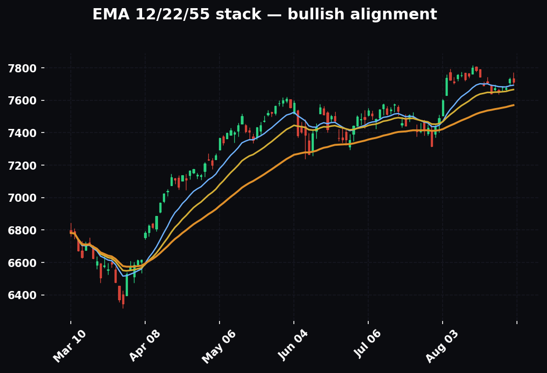
EMA 12/22/55 on the ratio itself. The Hollow Point trend framework works on a ratio chart exactly as it works on price. When the 12 is over the 22 is over the 55 and price is above all three, that sector is in a confirmed relative uptrend — money is trending IN. When the stack flips and the 55 rolls over, relative leadership is breaking down. The daily 55-EMA on a XLK/SPY chart is one of the cleanest "is this sector still the leader?" tells you'll find.
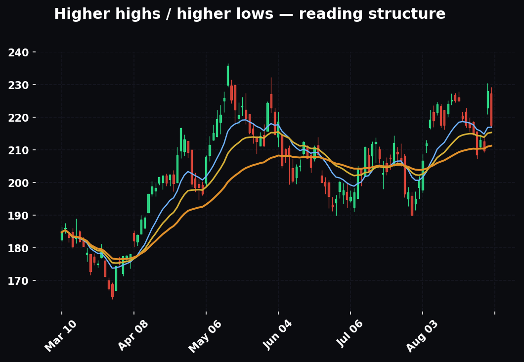
Structure on the ratio. Higher highs and higher lows on the XLF/SPY line means Financials are building relative leadership. Lower highs and lower lows means they're bleeding it. A ratio breaking to a new multi-month high is money making a decision — treat that break exactly as you'd treat a price breakout, including waiting for it to hold rather than buying the first poke through.
Divergence. If XLE's absolute price is flat but XLE/SPY is quietly grinding higher, energy is accumulating relative strength beneath a boring surface — often the first footprint of a late-cycle rotation before the sector's price even moves. This is the single highest-value pattern on a ratio chart: relative strength almost always turns before absolute price, so a ratio breaking out under a flat price is money positioning early, and you can position with it.
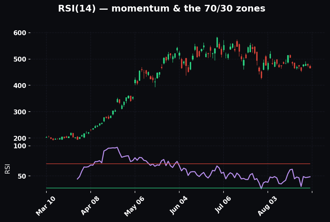
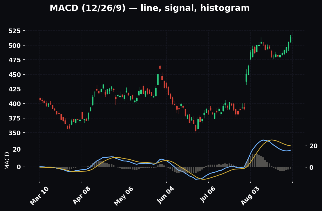
RSI and MACD on the ratio. Yes, you can drop an oscillator onto a ratio line. RSI on XLF/SPY making higher lows while the ratio makes lower lows is momentum divergence in the relative trend — early evidence that Financials' underperformance is losing steam. MACD crossing up on a sector ratio is a clean, mechanical "relative momentum just turned" flag. You're reading the flow with the same instruments you already own; you've just changed what's under them.
A worked example — the confident quiet day
Say it's a Monday. SPY is up 0.3%, nothing dramatic. You pull up four ratios: XLK/SPY, XLY/SPY, XLU/SPY, XLP/SPY. XLK and XLY ratios are both riding above a rising 22-EMA, making higher highs. XLU and XLP ratios are below a falling 55-EMA, making lower lows. Read it out loud: offense is trending in, defense is trending out, risk is ON, and the market's quiet-looking day is actually a confident one under the hood. That is a green light to hunt long setups in the leading groups — and a red flag against shorting them just because they "look extended."
The same tape flipped — the late-cycle warning
Flip it. XLU/SPY and XLP/SPY breaking to new highs while XLK/SPY and XLY/SPY roll under their 55-EMAs, all while the index itself is still near highs — that's the late-cycle warning. Defense is bidding, offense is being sold, and the index average is masking a leadership handoff toward safety. You tighten up, you get skeptical of breakouts, you respect your stops. The rotation warned you before the index did.
Put real numbers on it so it's concrete. Say SPY closes at a fresh all-time high, up 0.2% on the week — a headline that reads "market strong." But XLK/SPY has printed two lower highs over three weeks and just closed below its 55-EMA for the first time in five months. XLU/SPY has broken to a six-month high. XLP/SPY is turning up off its 55. And XLY/SPY — Discretionary, the pure risk-appetite gauge — is quietly making lower lows. Four ratios, one message: the index is being carried by a shrinking group of mega-caps while the money underneath rotates to safety. Nothing in the SPY candle tells you this. The ratios scream it.
The RRG mental model — a faster read
There's a tool called a Relative Rotation Graph that plots all eleven sectors at once on two axes — relative strength (are you strong vs the benchmark) and relative momentum (is that strength improving or fading). Sectors travel clockwise through four quadrants: Leading (strong and still improving), Weakening (strong but momentum fading — leaders getting tired), Lagging (weak and still fading), and Improving (weak but momentum turning up — tomorrow's leaders).
You don't need the fancy graph to use the idea. Every ratio chart tells you the same story: is this sector strong and getting stronger, or strong but fading? The sectors moving from Improving into Leading are where you want to be early. The ones sliding from Leading into Weakening are where the crowd still is but the money is leaving. The clockwise rotation is just the business cycle drawn as a circle — Improving is early cycle, Leading is the meat of a trend, Weakening is the top, Lagging is the downtrend. Same engine, plotted as a wheel.
The practical translation of the RRG for a ratio-chart trader: the best entries live in the Improving-into-Leading transition — a SECTOR/SPY ratio that's been below its 55-EMA (lagging), then reclaims it with a rising 12 and 22 and starts higher-highing. The best exits live in the Leading-into-Weakening transition — a ratio still above its 55 but making lower highs and losing the 12/22 stack. You buy the turn up out of weakness; you trim the fade out of strength. Everything the graph shows, two ratio charts and the EMA stack will show you too.
Rotation in Different Market Regimes
The same ratio charts mean different things depending on the weather of the overall market. Read them through the regime.
In a clean uptrend
In a trending bull market, rotation is at its most tradable and most trustworthy. Leadership is persistent — a sector that takes the lead tends to hold it for weeks or months, ratios trend cleanly, the EMA stack stays orderly, and pullbacks to the rising 55-EMA on a leading ratio are gifts. This is the regime the textbook running order describes best. Your job is simple: identify the leading ratios, buy pullbacks in the leaders, avoid the laggards, and let the trend do the work. The main risk here isn't misreading rotation — it's chasing extended ratios instead of waiting for the pullback.
In a chop / range regime
In a sideways, rangebound market, rotation gets treacherous, because leadership rotates faster and reverses more often. A ratio breaks out, sucks people in, and reverses within days. What looks like a new leader is often just the top of a range oscillation. Two adjustments: first, demand more confirmation — a ratio breakout in chop needs to hold, ideally with the 55-EMA actually turning up, not just a single close through a level. Second, watch for pair rotation — money sloshing back and forth between two groups (say Tech and Financials) without either establishing durable leadership. In chop, the honest read is frequently "no trend in the rotation either," and the discipline is to size down and stop forcing a directional thesis onto a market that doesn't have one.
In a high-volatility / risk-off regime
When volatility spikes and the market is falling hard, sector rotation simplifies to one question: offense or defense? In a genuine risk-off event, correlations go to one — almost everything sells together — but not equally. The ratios that matter collapse to XLU/SPY, XLP/SPY, and XLV/SPY (are defensives outperforming?) and XLK/SPY, XLY/SPY (how hard is offense being dumped?). When defensives are the only rising ratios on your screen, that's confirmation the selling is real risk-off, not noise — and it's not the time to buy the beaten-down growth names just because they're cheap, because relative strength says the money is still fleeing them. The turn you're waiting for is the first day offense ratios stop falling and defensive ratios stop rising even as the index makes a new low. That relative divergence — offense refusing to underperform further while price still drops — is the earliest footprint of a bottom, and it shows up in the ratios before it shows up in price.
Multi-Timeframe: Rotation on the Weekly, Daily, and Intraday
Rotation is a fractal. It runs on the weekly chart (the actual business cycle), on the daily (the tradable swing), and even intraday (fast money repositioning within a session) — and the timeframes should agree before you lean hard on the read.
The weekly ratio is the tide. XLK/SPY on a weekly chart with the 12/22/55 EMAs tells you the cycle-level leadership — the slow, dominant flow that lasts months. This is the highest-authority read. If the weekly XLE/SPY is in a confirmed uptrend above a rising 55-week EMA, energy's relative leadership is a fact of the current cycle, not a blip.
The daily ratio is the wave. The daily chart is where you find the tradable rotation — the pullbacks, the fresh breakouts, the EMA reclaims. You want the daily to agree with the weekly: a daily XLE/SPY pulling back to its rising 55-day EMA inside a confirmed weekly uptrend is the textbook "buy the leader on a dip" setup, because the tide and the wave point the same way.
The intraday ratio is the ripple. On a 15-minute XLK/SPY, you can watch fast money reposition inside a single session — useful for timing an entry, near-useless for the thesis. Intraday rotation reverses constantly and should never override the daily or weekly. Use it to fine-tune the trigger, not to form the view.
The rule that ties the timeframes together is the Hollow Point principle you already run on price: higher timeframe sets the bias, lower timeframe sets the entry. Weekly ratio says which team owns the cycle. Daily ratio says whether that sector is buyable right now. Intraday ratio helps you press the button. When all three ratios stack the same direction, that's timeframe-weighted confluence at the rotation level — and it's rare enough to pay attention when it shows up.
How It Combines With Your Other Tools
Rotation is a filter and a context, not a trigger. It tells you where and whether; other tools tell you when and at what price. Here's how it braids with the rest of the kit.
Rotation + market breadth
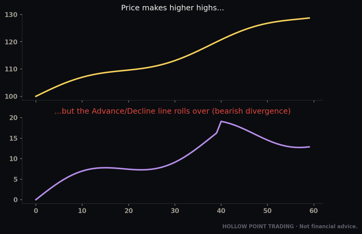
Breadth measures how many stocks are participating — advancers vs decliners, the percentage of stocks above their 50-day moving average, new highs vs new lows. Rotation and breadth are two views of the same underlying question — is this move healthy? — and they confirm each other beautifully. A tape where offense ratios are rising and breadth is broadening (most sectors participating, advance/decline line making new highs) is a durable, trustworthy uptrend. The dangerous divergence is the opposite: index at highs, but offense ratios fading, defensives leading, and breadth narrowing (fewer and fewer stocks above their 50-day, new-highs list shrinking). Rotation tells you the character of the money; breadth tells you the count. When both deteriorate under a rising index, that's about as loud as a top-warning gets.
Rotation + EMA trend framework
You already run 12/22/55 on price for trend. Run it on the ratio for relative trend, and demand they agree. The cleanest long is a stock whose price is in a confirmed 12/22/55 uptrend AND whose relative-strength ratio (stock/sector) is also above a rising 55 — the stock is trending up and leading its group. When price trend and relative trend disagree — price rising but the ratio falling — you've got a stock going up slower than its peers, a laggard being dragged along by a strong group. It'll be the first to break when the group cools. Same three EMAs, two different charts, one confluence check.
Rotation + support/resistance and the golden pocket
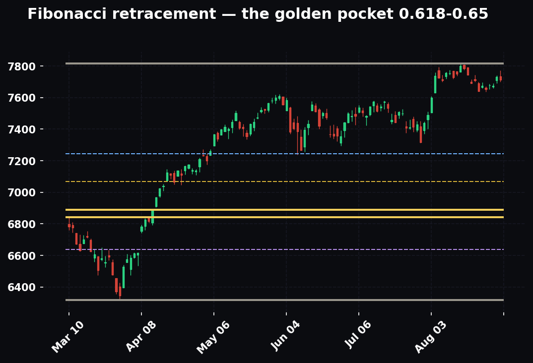
Rotation gets you to the right sector; horizontal levels and Fibonacci get you a price to actually act on. The play: use the ratio to confirm the sector is being bought, then drop to the leading stock inside it and wait for it to pull back into a real level — a prior breakout shelf, the 0.618–0.65 golden pocket of the last leg, a rising daily 55-EMA. The rotation supplies the conviction (money is flowing into this group, so this dip is more likely to be bought than broken); the level supplies the entry and the stop. Buying a golden-pocket reclaim in the strongest stock in the strongest sector, with the ratio confirming inflow, is about as much confluence as you'll ever get to line up at once — and it's exactly the kind of stacked read the Hollow Point process is built to find.
How It Fits the Top-Down Process
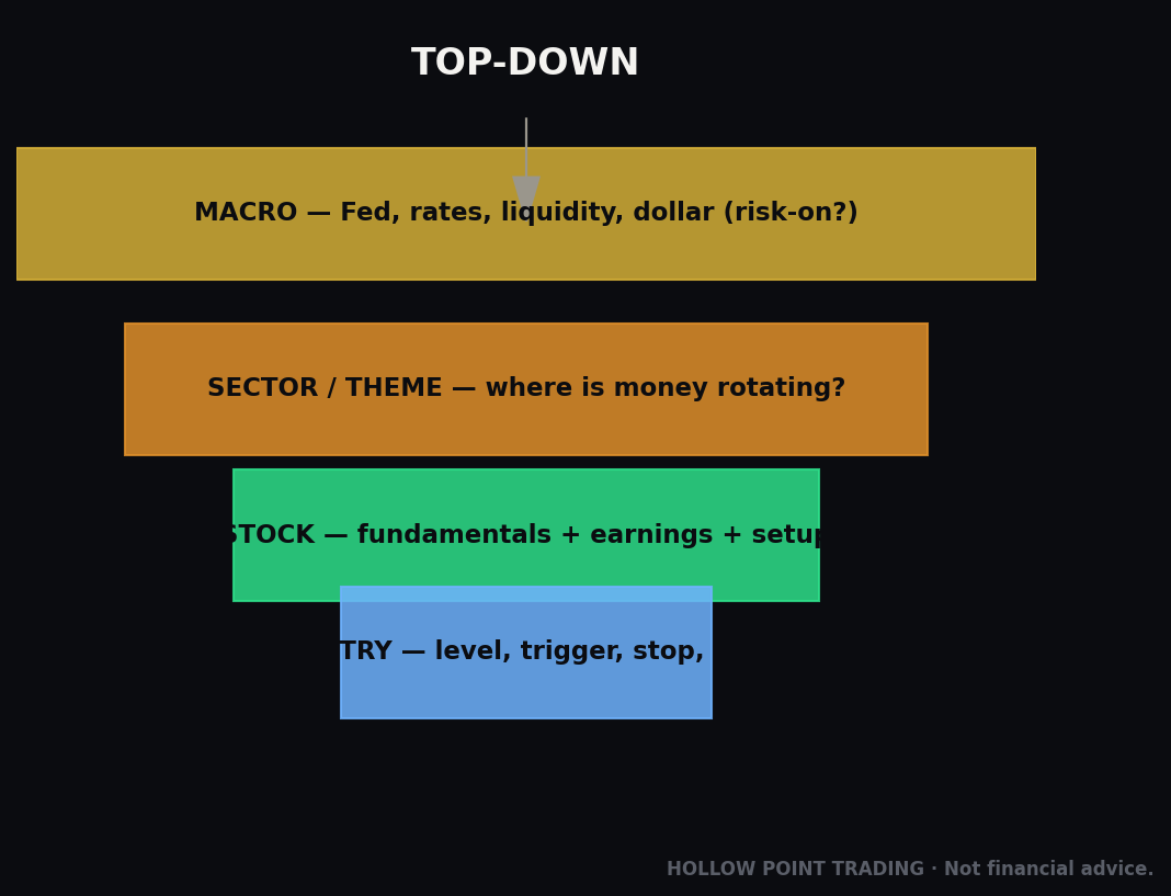
This is the heart of it. Sector rotation isn't a standalone strategy — it's the middle rung of the macro→sector→stock funnel, the step that turns a big-picture read into a specific place to hunt.
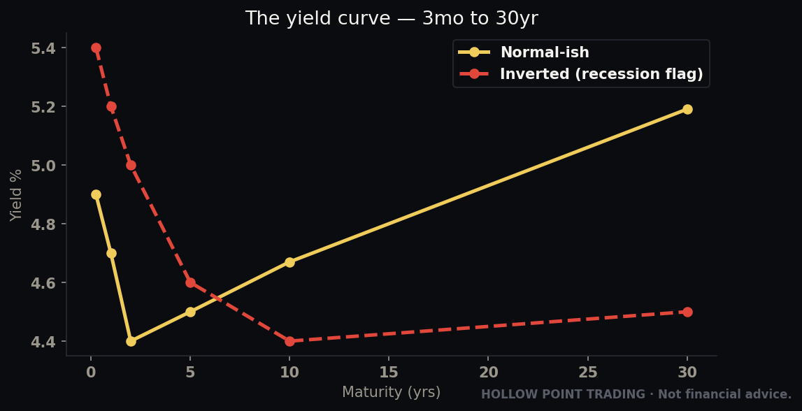
Rung one: macro. Where are we in the cycle? What are rates doing — cutting, holding, hiking? Is inflation rising or cooling? Is the yield curve steepening or inverting? You don't need a PhD; you need a lean. "Fed is done hiking, inflation cooling, growth soft but stabilizing" is a lean. That lean tells you which phase you're likely in, which tells you which team — offense or defense — should be leading.
Rung two: sector — and this is where rotation lives. Now you verify the macro lean against the actual flow. This is the discipline-over-prediction principle in action. The cycle map says "early cycle, Discretionary should lead." Fine — go pull XLY/SPY. Is it actually trending up? Is the 12/22/55 stacked bullish on the ratio? If yes, macro thesis and money flow agree — that's confluence, and you've found your hunting ground. If the map says one thing and the ratio says another, the ratio wins. The tape is the truth; the map is the hypothesis. Money rotating IN is something you can see and measure. Never override a falling ratio with a macro story you're in love with.
So the concrete question at this rung — the exact one from the Hollow Point checklist — is: is money rotating INTO this group? You answer it with the ratio chart and the EMA framework, not with a feeling. Rising ratio, bullish EMA stack, higher highs on the relative line: yes, money is flowing in, this group earns a spot on the watchlist. Falling ratio: no, skip it, no matter how good a single name inside it looks.
Rung three: stock. Only now do you go find individual names — and you find them inside the winning sector, then you run the same relative-strength test one level down. Pull NVDA/XLK: is this specific chip name leading its own sector, or lagging it? The cleanest setups in the whole market are the ones where all three ratios line up: the stock is outperforming its sector (NVDA/XLK rising), the sector is outperforming the market (XLK/SPY rising), and the market is in an uptrend. That's timeframe-weighted, multi-level confluence — the strong stock, in the strong sector, in the strong market. Stack those and you're not guessing; you're standing exactly where the money is going, at every level of the funnel.
A full funnel walk-through with numbers
Make it concrete end to end. Macro lean: the Fed just signaled it's done hiking, inflation prints are cooling month over month, growth is soft but not contracting. That's a late-mid-cycle read leaning toward "growth can reassert as rate pressure comes off." Hypothesis: Tech should lead as the rate headwind fades.
Rung two, verify: pull XLK/SPY daily. It reclaimed its 55-EMA three weeks ago, the 12 is over the 22 is over the 55, and it just made a higher high. Confirmed — money is rotating into Tech, the macro lean and the tape agree. But you also glance at the tells: XLU/SPY is fading, XLP/SPY is below its 55. Defense is being sold. Risk is on. The confluence is real, not a lone signal.
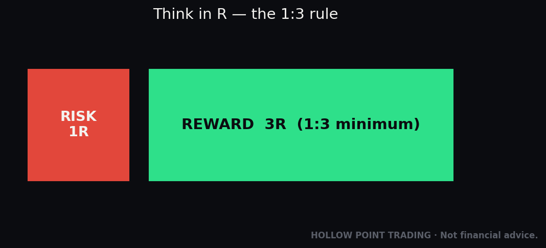
Rung three, drop down: inside XLK you check the leaders. NVDA/XLK is rising — outperforming its own sector. AAPL/XLK is flat-to-down — lagging. You favor the outperformer. Now you wait for a level: NVDA pulls back into the golden pocket of its last leg, which coincides with its rising daily 55-EMA and a prior breakout shelf. Price trend up, relative trend up, sector inflow confirmed, defense being sold, entry at a real level with a defined invalidation just under it. You size the position so your stop below the level is a fixed fraction of the account, and your target is set for at least 1:3. That is the whole funnel — macro lean, sector confirmation, stock selection by relative strength, level for the trigger — resolved into one disciplined trade.
That stacked read is what makes rotation a front-running tool. Because the ratio turns before the absolute price breakout, and the sector turns before the index, you're getting your signal one step upstream of the crowd. You're on the watchlist before the move, with a defined level, ready to execute your 1:3 when the setup triggers — instead of chasing the candle after everyone can see it.
How the Pros Use It Differently From Beginners
Same tool, completely different application. The gap between how a beginner and a professional use sector rotation is worth spelling out, because closing it is most of the skill.
Beginners look at absolute sector performance; pros look at relative strength. The beginner opens a heat map, sees XLE up 2%, and buys energy. The pro pulls XLE/SPY, sees whether that 2% is leadership or just beta, and checks whether the relative line is trending or extended. One is reacting to a color; the other is reading a decision.
Beginners react to today; pros track the trend of the flow. A beginner sees Tech red today and panics. A pro looks at the XLK/SPY ratio and asks whether one red day changed the relative uptrend — it almost never does. Rotation is a slow-moving current; the pro trades the current and ignores the daily splash.
Beginners trade the map; pros trade the tape and use the map as a checklist. The beginner memorizes "late cycle = buy energy" and buys energy regardless of what energy is actually doing. The pro uses the cycle map to know what to look for, then lets the ratio confirm or veto it. The map is a hypothesis generator, never a trade signal.
Beginners watch offense; pros watch defense hardest. New traders ignore the boring sectors. Professionals keep XLU/SPY and XLP/SPY front and center precisely because they're the honest early-warning system — the small, un-glamorous ratios that turn up before the exciting stuff breaks down.
Beginners want one winner; pros read the whole board as a system. A beginner wants the answer "buy this sector." A pro reads all eleven ratios relative to each other — who's leading, who's fading, who's improving out of weakness — and positions across the transitions. They're not looking for a stock tip; they're reading a rotation map and standing where the next handoff points.
Beginners enter on the ratio; pros enter on the level. The most common intermediate mistake is treating a rising ratio as a buy signal by itself. Rotation is a filter, not a trigger — it tells the pro which names to load into the watchlist, and then they wait for price to reach a real level with a defined stop before committing a dollar. Conviction from rotation; entry from structure.
Beginners think of it as a stock-picking hack; pros think of it as risk management. For the professional, the single most valuable output of rotation analysis isn't the long idea — it's the warning. Defensives leading under a rising index tells them to tighten stops, cut size, and stop pressing longs before the drawdown, not after. Rotation is worth more as a defense mechanism than as an offense one.
The Common Mistakes
Mistake 1: Watching only absolute price. A stock closing green while its stock/sector ratio makes a lower low is losing the internal battle. You feel good about the green candle; the money is quietly leaving. Always ask "faster or slower than its group?" — not just "up or down?" The green candle is the tide lifting everything; the ratio tells you whether this boat is one the money actually chose.
Mistake 2: Trading the cycle map instead of the tape. The early/mid/late/recession sequence is a hypothesis, not a schedule. Cycles stretch, skip, and get overridden by the Fed and by shocks. If you buy Energy because "it's late cycle" while XLE/SPY is in a clean downtrend, you're trading a textbook against live money — and live money wins. The map tells you what to check; the ratio tells you what's true.
Mistake 3: Confusing a strong sector with a strong stock. A leading sector is full of laggards. XLK ripping doesn't mean every chip name is worth buying — some are the reason the average is up, others are dead weight being carried. Always drop to stock/sector before you commit. The sector gets you to the right neighborhood; the relative-strength check finds the right house.
Mistake 4: Chasing a ratio that's already extended. Relative strength trends, but it also mean-reverts. A XLE/SPY ratio that's gone vertical and stretched far above its 55-EMA is a leader you should have bought earlier, not a fresh entry. Rotation is for positioning ahead of moves, not piling into them at the end. If you're late, wait for the pullback to the rising EMA, don't buy the blow-off.
Mistake 5: Ignoring the defensive tell. New traders watch offense and never look at defense. But Utilities and Staples quietly outperforming is one of the most reliable early warnings that risk appetite is fading under a strong-looking index. Keep XLP/SPY and XLU/SPY on your screen precisely because they're boring — they'll warn you before the exciting stuff breaks.
Mistake 6: Forgetting rates and the dollar. Rotation doesn't happen in a vacuum. Rising rates hammer rate-sensitive groups (Real Estate, Utilities, long-duration Tech). A strong dollar pressures Materials and multinational earners. When a rotation confuses you, check the 10-year yield and the dollar — half the time they're the reason. A XLU/SPY breakout is often just the bond market rallying; a XLK/SPY swoon is often just the 10-year yield spiking. Read the ratio and its driver.
Mistake 7: Over-trading the middle. Mid-cycle leadership is muddy on purpose. If every ratio looks like noise and nothing is clearly leading, that's information too — it means there's no clean rotation edge right now, so you lean on other tools and size down. Not every day has a rotation trade. Discipline includes sitting out the mush.
Mistake 8: Using the wrong benchmark. Dividing everything by SPY hides the mega-cap distortion. When two or three giant Tech names dominate the index, XLK/SPY can look flat even while the average Tech stock is bleeding, because both the numerator and denominator are stuffed with the same giants. Cross-check with XLK/RSP (equal-weight) to see whether Tech is really leading or whether it's just Nvidia and Apple carrying a hollow sector. Wrong denominator, wrong conclusion.
Mistake 9: Reading one day as a rotation. A single session of Energy outperforming is not a rotation — it's noise. Real rotation is a trend on the ratio: multiple higher highs, a reclaimed and rising 55-EMA, structure that holds for weeks. Treating every daily wiggle as a regime change will chop you to pieces and have you flip-flopping leadership every session. Demand a trend, not a candle.
Mistake 10: Buying the ratio without a price level. The rising ratio is conviction, not a trigger. Traders who "buy the leader" the moment the ratio ticks up end up entering at terrible prices with no defined stop. Rotation tells you what to hunt; a real level — support, golden pocket, rising 55-EMA — tells you where to enter and where you're wrong. Skip the level and you've thrown away your risk management.
Mistake 11: Ignoring the absolute trend entirely. The opposite error of Mistake 1. A stock can have gorgeous relative strength — leading its sector all the way down in a bear market. "Best house in a burning neighborhood" is still on fire. Relative strength is a filter you apply on top of an absolute uptrend, not a replacement for it. You want strong-relative AND strong-absolute; leading a falling group is not a long.
Mistake 12: Forgetting that rotation is a spectrum, not a switch. Risk isn't simply "on" or "off." Money moves along the offense-to-defense spectrum by degrees — from Tech to Industrials (still risk-on, but more cyclical), from Industrials to Staples (getting cautious), from Staples to Utilities and then to bonds (full flight). Reading it as a binary makes you miss the gradual de-risking that's the actual early warning. Watch the direction of travel across the whole spectrum, not just the two endpoints.
Frequently Asked Questions
Do I need a paid RRG or special rotation software? No. Everything in this guide runs on ratio charts you build for free by typing XLK/SPY into the symbol box, plus the 12/22/55 EMAs you already use. The fancy graph is a convenience, not a requirement — the ratios contain the same information.
How often should I check rotation? The cycle-level flow moves slowly, so a weekly deep-read of all eleven SECTOR/SPY ratios plus a quick daily scan of the four key ones (XLK, XLY, XLU, XLP over SPY) is plenty for a swing trader. Intraday rotation only matters if you're timing an entry that day.
What benchmark should I divide by — SPY or something else? SPY for the standard "is this beating the market?" read. Use RSP (equal-weight) as a cross-check to remove mega-cap distortion, and use a direct offense/defense ratio like XLK/XLU when you want a clean risk-on/risk-off gauge. Choose the denominator to match the question you're asking.
Can I apply this to crypto, futures, or international markets? The tool — relative strength via ratio charts — is universal. BTC/ETH, NQ/ES, or EEM/SPY all read the same way: rising means the numerator is winning the flow. The cycle sequence is specific to equity sectors, but the ratio-chart skill transfers anywhere there's a benchmark to measure against.
How do I know if a ratio breakout is real or a fake-out? Same way you judge a price breakout: does it hold, does the 55-EMA actually turn up, does structure confirm with a higher low after the break, and — the rotation-specific check — is the other side confirming (if offense breaks up, are defensives breaking down)? One-sided rotation is suspect; two-sided rotation is real.
What if the sector is leading but the individual stock isn't? Then you don't own that stock. A leading sector with a lagging name means the group's strength is coming from other holdings. Find the name whose stock/sector ratio is also rising. Don't buy the laggard hoping the sector drags it up — it'll be first to break when the group cools.
Does rotation work in a market driven by a few mega-caps? It works, but you have to read it carefully. When the index is dominated by a handful of giants, SECTOR/SPY ratios get distorted because those giants are in both the sector and the benchmark. Lean on equal-weight comparisons (RSP, XLK/RSP) and on the small, uncontaminated defensive ratios to get an honest read on breadth.
Is a rising defensive ratio always bearish? Not always — sometimes it's just the bond market rallying and dragging bond-proxy sectors (Utilities, Staples) with it on falling yields. That's why you cross-check with the 10-year and with offense: defensives rising while offense falls and breadth narrows is the bearish tell. Defensives rising on their own, with offense fine, is often just a rate move.
The Cheat-Sheet
Pin this. It's the whole guide compressed to what you'll actually use Monday.
The eleven sectors and their ETFs: XLK Tech · XLY Discretionary · XLC Communications · XLF Financials · XLI Industrials · XLB Materials · XLE Energy · XLP Staples · XLU Utilities · XLV Health Care · XLRE Real Estate.
The heavyweights vs the tells: Heavyweights (move the index) = XLK, XLC, XLY, XLF. Tells (too small to move it, honest enough to warn you) = XLU, XLP, XLB, XLE. Watch the tells for early rotation the index is hiding.
The two teams: Offense = XLK, XLY (risk ON). Defense = XLU, XLP, XLV (risk OFF). Which team leads tells you the market's real mood. Read it as a spectrum, not a switch — money de-risks by degrees.
The cycle running order:
- Early (rates low, recovery) → XLY, XLF, XLRE, XLI
- Mid (steady growth) → XLK
- Late (inflation up, rates rising) → XLE, XLB
- Recession (contraction, fear) → XLP, XLU, XLV
The one tool: the ratio chart. SECTOR/SPY. Rising = money flowing IN. Falling = money flowing OUT. Flat = no edge. The number is meaningless; only the slope and trend matter.
Choose your denominator on purpose: /SPY = beating the market. /RSP = beating the average stock (strips mega-cap distortion). /XLU = pure risk-on vs risk-off. STOCK/SECTOR = beating its own group.
Read the ratio like price: EMA 12/22/55 stack for trend, structure (HH/HL vs LH/LL) for leadership, divergence for early footprints, RSI/MACD on the ratio for relative momentum. The daily 55-EMA on the ratio is your "still the leader?" line.
Regime adjustment: Trend = leadership persists, buy pullbacks in leaders. Chop = leadership whipsaws, demand held breakouts, size down. High-vol/risk-off = it collapses to offense-vs-defense; the turn is offense refusing to underperform on a new index low.
Multi-timeframe: Weekly ratio = the tide (cycle leadership). Daily ratio = the wave (the tradable setup). Intraday ratio = the ripple (entry timing only). Higher TF sets bias, lower TF sets entry.
The top-down funnel:
- Macro → what phase? which team should lead?
- Sector → is money actually rotating IN? (
SECTOR/SPYratio confirms or kills the thesis — the ratio wins) - Stock → strongest name inside the winning sector (
STOCK/SECTORrising)
The confluence stack you're hunting: strong stock (stock/sector up) + strong sector (sector/SPY up) + strong market (index up) + a real price level to enter on. All aligned = stand exactly where the money's going, then wait for your 1:3 trigger.
The daily one-minute scan: pull XLK/SPY, XLY/SPY, XLU/SPY, XLP/SPY. Offense ratios up + defense ratios down = risk ON, hunt longs in leaders. Defense ratios breaking up while the index sits at highs = late-cycle warning, tighten up.
Rotation is a filter, not a trigger: it tells you what to hunt and whether to trust the move. Price levels tell you when and where to act. Never enter on the ratio alone.
The rule that ties it together: rotation front-runs the index. The ratio turns before the price breakout; the sector turns before the average. Read the vote early, get on the watchlist early, execute the trigger with discipline. You're not predicting the economy — you're reading where the money already chose to go.
Sector rotation is how you stop trading the market as one blurry thing and start seeing the eleven separate decisions being made underneath it every single day. The index tells you what already happened to the average. The ratios tell you what the money is doing right now, and where it's going next. Learn to read the flow, plug it into the funnel, respect the levels for your entries, and you'll be standing in the leading group — with a plan and a stop — while everyone else is still staring at the index wondering why their green day feels so hollow.
Bound by rules, feared by trade.