
If you have ever looked at a stock chart and seen a wall of little red and green rectangles with thin lines poking out the top and bottom, you have already met candlesticks. They probably looked like noise. By the end of this guide, they will look like sentences — each one telling you a small, honest story about who won a fight between buyers and sellers, and by how much.
This is the beginner track. That means we assume you have never placed a trade, never opened a brokerage account, and have no idea what "the close" means. We define every word the first time we use it. We go slow. And by the end you will be able to open any chart on Monday morning and actually read it.

Let's begin.
What a candlestick actually is (in plain English)
A candlestick — usually just called a "candle" — is a small drawing that summarizes everything that happened to a price during one chunk of time.
That "chunk of time" is called the timeframe. If you are looking at a daily chart, each candle represents one full trading day. On a 5-minute chart, each candle represents five minutes. On a weekly chart, each candle is one week. Same drawing, different amount of time squeezed inside it. This matters a lot, and we will come back to it.
Here is the key idea: a lot of things happen during a single day. The price goes up, down, sideways, up again. Thousands of people buy and sell. A candlestick takes all of that chaos and boils it down to just four numbers. Four numbers, and yet those four numbers tell you almost everything you need to know about the mood of that time period.
Think of a candle like a box score for a single inning of a baseball game. You weren't there for every pitch, but the box score tells you who scored, when, and by how much. The candle is the box score for price.
The four numbers: open, high, low, close
Every candlestick is built from exactly four prices. Learn these four words and you are already halfway to reading a chart.
The Open — the price at the very first moment of the time period. If it's a daily candle, the open is the price the very second the market opened for the day. Think of it as the starting whistle.
The High — the highest price reached at any point during that time period. Even if price only touched it for one second before falling back down, the high records that peak. Think of it as the highest the buyers managed to push.
The Low — the lowest price reached at any point during the period. The deepest the sellers managed to drag it down, even briefly.
The Close — the price at the very last moment of the period. If it's a daily candle, the close is the final price when the market shut for the day. This is the most important of the four, and we'll explain why shortly. Think of it as the final score.
So four numbers: where it started (open), the highest it went (high), the lowest it went (low), and where it ended (close). Traders often shorten this to OHLC — Open, High, Low, Close. When you hear someone say "OHLC," they just mean these four numbers.
Body versus wick: the two parts of every candle
Now we turn those four numbers into a picture. A candlestick has two parts, and telling them apart is the single most useful skill in this whole guide.
The body is the thick, fat rectangle in the middle. The body is drawn between the open and the close. It shows you where price started and where it ended — the net result of the whole period.
The wick (also called the shadow or the tail) is the thin line sticking out of the top and/or bottom of the body. The wick reaches up to the high and down to the low. It shows you the extremes price touched but did not hold onto.
So the body is where the fight settled, and the wicks are how far the fight spilled over before coming back.
Here's the analogy that makes it stick. Imagine a tug-of-war between two teams: buyers (who want the price to go up) and sellers (who want it to go down). During the time period, the rope gets yanked way up (that's the high) and yanked way down (that's the low). But when the whistle blows, the rope ends up somewhere in the middle. The body is where the rope finished versus where it started. The wicks are the farthest each team dragged it before losing ground.
A long wick means a team made a big push and then failed to hold it. That failure is information. A long lower wick, for example, means sellers shoved price way down, but buyers came storming back and shoved it back up before the close. That tells you buyers were strong at those low prices. We'll use this idea constantly.
Green versus red: who won?
Candles are colored, and the color tells you one simple thing at a glance: did the period end higher or lower than it started?
Green candle (some platforms use white or hollow): the close was higher than the open. Price finished the period above where it began. Buyers won the period. This is called a bullish candle — "bullish" just means leaning upward, like a bull tossing its horns up.
Red candle (some platforms use black or filled): the close was lower than the open. Price finished below where it began. Sellers won the period. This is a bearish candle — "bearish" means leaning downward, like a bear swiping its paw down.
One thing that trips up every single beginner, so read this twice: the color has nothing to do with whether the wicks are long or where they are. The color is decided only by comparing the open to the close. A candle can be green (closed higher than it opened) and still have dropped a huge amount at some point during the period — you'd see that as a long lower wick. Green means "ended up higher than it started," full stop.
And here's a memory trick for reading the body of a green candle versus a red one: on a green candle, the open is the bottom of the body and the close is the top (because it went up). On a red candle, it's flipped — the open is the top of the body and the close is the bottom (because it went down). The high and low, being the extremes, are always at the tips of the wicks regardless of color.
A fully worked beginner example
Let's build a real candle from scratch with actual numbers so this stops being abstract.
Imagine a stock we'll call Acme Corp, ticker ACME. We're looking at a daily chart, so we're going to build one candle representing one full day of trading.
Here's what happened to ACME today:
- The market opened and the first trade printed at $100.00. That's our open.
- Early in the day, optimistic buyers pushed it all the way up to $104.00 before it slipped back. That $104.00 is the highest it ever touched — our high.
- Around lunchtime, some bad news hit and sellers dumped it down to $97.00 before buyers stepped back in. That $97.00 is the lowest it touched — our low.
- By the closing bell, it settled and the final trade of the day was $103.00. That's our close.
So our OHLC is: Open $100, High $104, Low $97, Close $103.
Now let's draw it. Is it green or red? The close ($103) is higher than the open ($100), so it's green — a bullish day. Buyers won.
The body stretches from the open ($100) at the bottom to the close ($103) at the top — a $3 tall body. That's a decent, solid body: price made real upward progress.
The upper wick goes from the top of the body ($103) up to the high ($104) — just a $1 wick. Small. Buyers pushed a little past the close but not much.
The lower wick goes from the bottom of the body ($100) down to the low ($97) — a $3 wick. That's a big lower wick, as tall as the body itself.
Now read the story out loud: "ACME opened at 100. Sellers tried to break it and dragged it all the way down to 97 — a real attack. But buyers absolutely refused to let it stay there, bought it all back up, and drove it to close at 103, near the highs of the day. Buyers were in control by the end, and that long lower wick shows they defended the 97 level hard."
That's it. That's reading a candle. You just did technical analysis. One candle, four numbers, and a story about a tug-of-war. Every candle on every chart is exactly this.
Why a beginner should care about all this
You might be thinking: okay, but so what? Here's why this is the foundation everything else is built on.
Candles are the raw language of price. Every fancy indicator, every strategy, every "signal" you will ever hear about is ultimately built on top of these four numbers. If you can't read a candle, everything else is a house built on sand. If you can read a candle, you can look at a chart and immediately sense whether buyers or sellers are in charge, whether a move is strong or exhausted, and where the fights are happening.
They show you emotion and momentum, not just price. A plain line chart just connects the closing prices with a line. It tells you where price went. Candles tell you how it got there — the struggle, the failed pushes, the reversals inside the period. That "how" is often more useful than the "where."
They help you protect your money. This is the Hollow Point way, and it matters more than any pattern: the whole point of learning to read candles is not to predict the future. It's to react intelligently and to know when you're wrong. A candle can tell you, "buyers just defended this exact price twice" — which gives you a logical spot to place your safety net. More on that soon.
Reading candles in a group: context is everything
A single candle is a word. But you don't read a book one word at a time in isolation — you read them in sentences. Candles work the same way. A single candle rarely means much on its own; it means something because of the candles around it.
Two quick pieces of vocabulary you'll need:
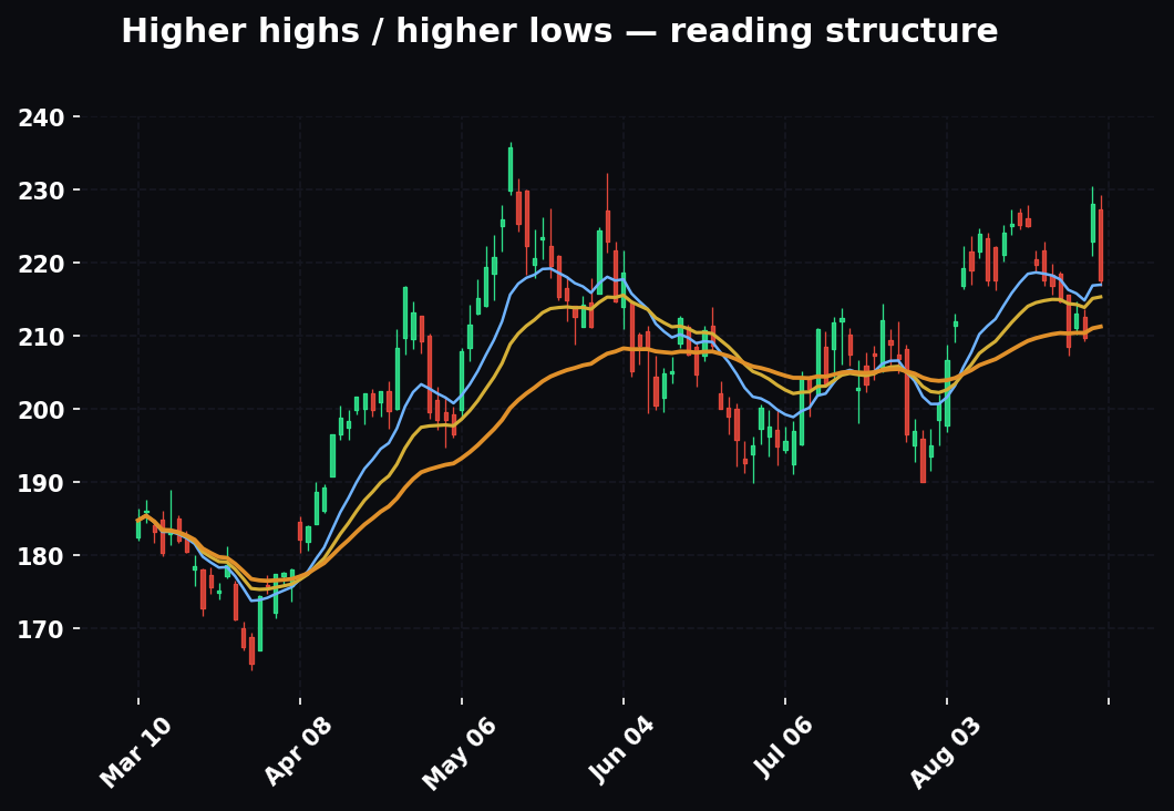
An uptrend is when price is generally making higher highs and higher lows over time — the candles march up like a staircase going up to the right. Buyers are broadly in control.
A downtrend is the opposite — lower highs and lower lows, a staircase going down to the right. Sellers are broadly in control.
Sideways or a range is when price bounces between roughly the same top and bottom without going anywhere — buyers and sellers are evenly matched.
The reason context matters: a certain candle appearing at the end of a long downtrend might scream "the sellers are finally exhausted." That exact same candle appearing in the middle of a calm uptrend might mean almost nothing. Same word, different sentence, different meaning. Keep this in your head as we look at patterns — where a pattern shows up matters as much as what it is.
The three patterns worth learning first
There are dozens of named candlestick patterns, and beginners often try to memorize all of them at once. Don't. It's a trap. Learn these three deeply, understand why they work, and you'll be ahead of most people. We're picking these three because they're common, they're reliable enough to be useful, and — most importantly — each one teaches a principle you can apply everywhere.
Pattern 1: The Doji — indecision
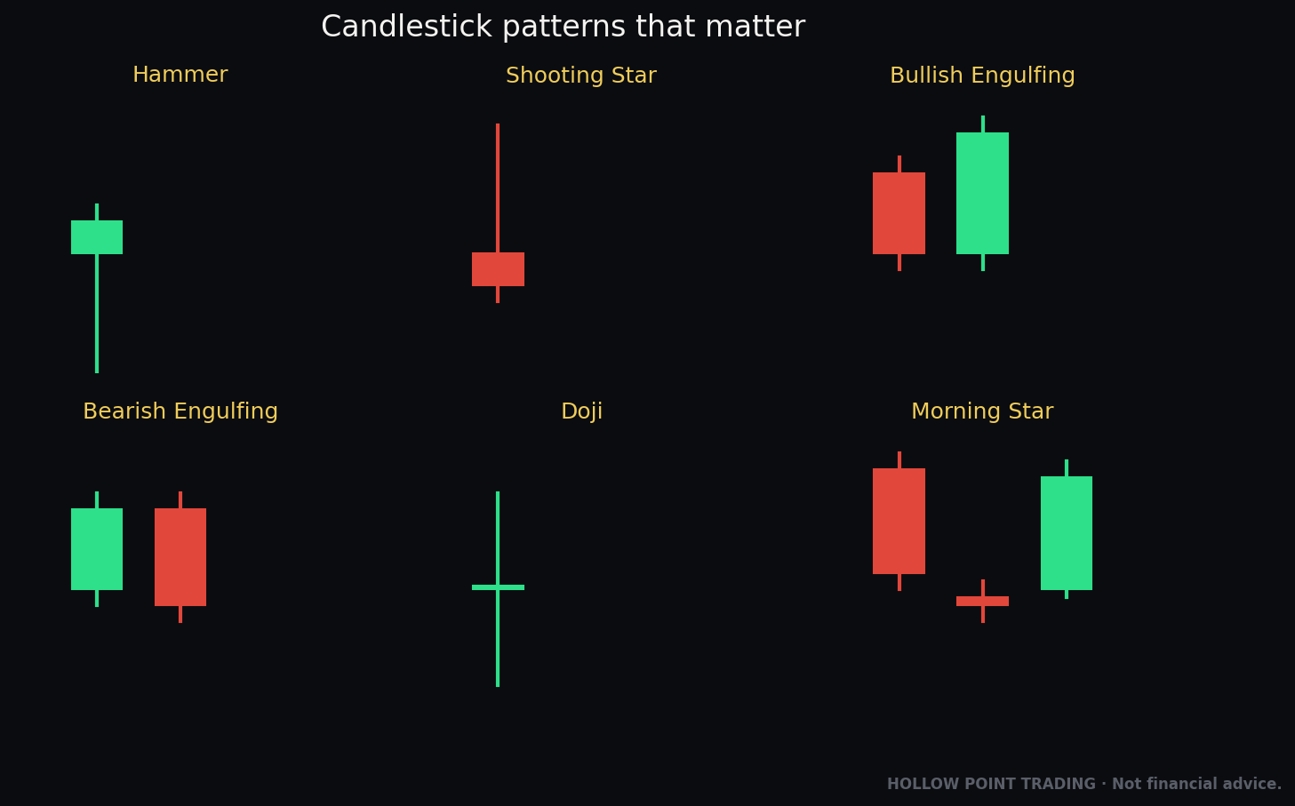
A doji (pronounced "DOH-jee") is a candle with almost no body. The open and the close are at nearly the same price, so the fat rectangle shrinks down to a thin line or a little cross or plus sign, usually with wicks sticking out both the top and bottom.
What does it mean? Indecision. A tie in the tug-of-war. Price went up, price went down, buyers pushed, sellers pushed — and when the whistle blew, they ended up almost exactly where they started. Neither team won. The market is undecided.
Why should a beginner care about a tie? Because a doji shows up at interesting moments. If price has been ripping upward in a strong uptrend for days and then suddenly prints a doji, that's the first sign the buyers might be getting tired. The relentless upward push just stalled into a tie. It doesn't guarantee a reversal — it's a caution flag, not a stop sign. It says: "the momentum just paused; pay attention."
A quick worked example: XYZ stock has closed green for five days straight, climbing from $50 to $60. On the sixth day it opens at $60.10, spikes to $61, dips to $59, and closes at $60.05 — a tiny body, wicks both sides. That's a doji. The message: after five days of buyers dominating, they suddenly couldn't push higher. The trend just took its first breath. Watch the next candle closely to see who takes over.
Pattern 2: The Hammer — a rejection of lower prices
A hammer is a candle with a small body up near the top and a long lower wick at least twice as tall as the body, with little or no upper wick. It literally looks like a hammer or a mallet — a small head on top, a long handle below.
Remember what a long lower wick means from our ACME example: sellers dragged price way down, but buyers came roaring back and pushed it up to close near where it opened. A hammer is that story in its purest form. Sellers tried hard to establish lower prices, and completely failed — buyers rejected those low prices and reclaimed almost all the ground by the close.
A hammer is most meaningful when it appears at the bottom of a downtrend — after price has been falling. It suggests the sellers, who had been winning, just got overpowered at the lows. That long lower wick is the footprint of buyers stepping in aggressively. It's a potential sign that the downtrend is ending and a bounce could be coming.
Worked example: DEF stock has been falling for a week, from $80 down to $70. On the next day it opens at $70, sellers crush it down to $66, but by the close buyers have hauled it back up to $69.50. Small body near the top, long $3.50+ lower wick. That's a textbook hammer at the bottom of a downtrend. The read: "sellers tried to break 66 and got rejected hard. The buyers just showed up. The down-move may be running out of gas."
(A small note for the curious: a candle with the long wick on top instead of the bottom, appearing after an uptrend, is called a shooting star — it's the hammer's mirror image and means buyers failed at the highs. Same principle, flipped. Learn the hammer well and the shooting star is free.)
Pattern 3: The Engulfing — a takeover
An engulfing pattern is made of two candles, and it's one of the most powerful beginner signals because it shows a clear change of control.
A bullish engulfing happens when a small red candle is immediately followed by a big green candle whose body completely engulfs (covers) the red candle's body. The green body opens at or below the red body's bottom and closes at or above the red body's top — it swallows it whole.
Read the story: on the first day, sellers were in control — a red candle. On the second day, buyers didn't just win, they dominated — they erased the entire previous day's decline and then some. That's a decisive shift of control from sellers to buyers in a single day. When this shows up at the bottom of a downtrend, it's a strong hint the tide has turned.
A bearish engulfing is the exact mirror: a small green candle followed by a big red candle that swallows it whole. Buyers were winning; then sellers took over completely. When this appears at the top of an uptrend, it warns the up-move may be done.
Worked example: GHI stock is in a downtrend. Monday prints a small red candle: open $52, close $51. Tuesday opens at $50.80 (below Monday's close) and closes at $53 (above Monday's open) — a big green candle that completely covers Monday's body. That's a bullish engulfing at the bottom of a downtrend. The read: "yesterday the sellers nudged it lower; today the buyers didn't just show up, they took the whole thing back and then some. Control has flipped."
Notice the theme running through all three patterns: they're all about who is winning the tug-of-war and whether that's about to change. Doji = a tie, momentum paused. Hammer = one team's push failed. Engulfing = control flipped hands. You're not memorizing shapes — you're reading a fight.
The beginner mistakes to avoid
These are the exact traps that catch nearly everyone starting out. Read them now and save yourself months of confusion.
Mistake 1: Trading a single candle with no context. A hammer in the middle of nowhere means little. A hammer at the bottom of a clear downtrend, at a price where the stock bounced before, means a lot. Where the candle appears is half the signal. Never react to a candle in isolation.
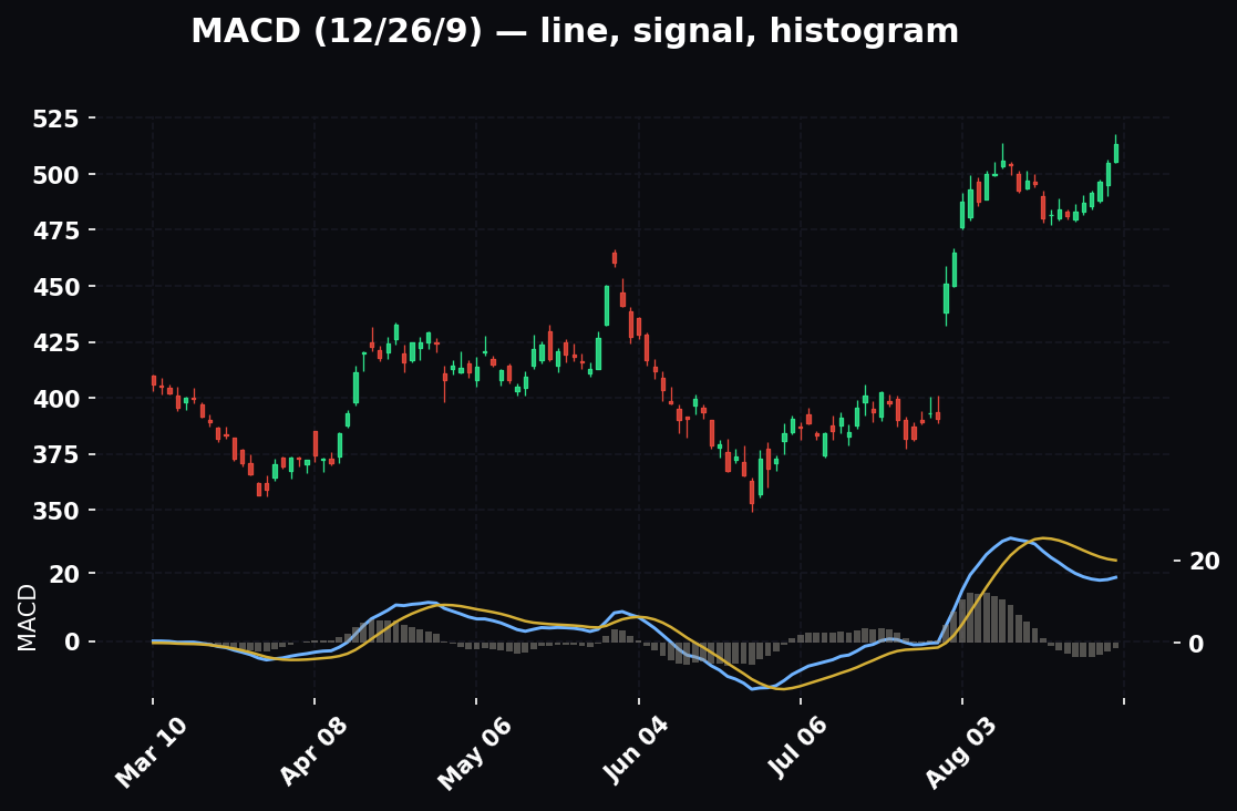
Mistake 2: Thinking patterns are guarantees. They are not. A bullish engulfing does not promise price will go up. It tilts the odds — it's evidence, not prophecy. Sometimes the pattern appears and price does the opposite. That's normal. This is why we never bet the farm on one signal, and why the safety net (below) exists. Anyone who tells you a candle pattern "always" works is selling you something.
Mistake 3: Forgetting the timeframe. A gorgeous hammer on a 1-minute chart is a tiny blip that might reverse in ninety seconds. That same hammer on a weekly chart is a massive, meaningful event. Always know which timeframe you're looking at. Bigger timeframes carry more weight because more people and more money went into forming that candle. When a daily chart and a weekly chart agree, that's far stronger than a 1-minute chart alone.
Mistake 4: Confusing color with strength. A green candle isn't automatically "good and strong." A green candle with a tiny body and giant wicks is actually weak and indecisive, even though it's green. Read the body-to-wick relationship, not just the color.
Mistake 5: Seeing patterns that aren't there. Beginners get excited and start labeling every candle a hammer or a doji. Be strict. A hammer needs a lower wick at least twice the body. An engulfing needs the second body to fully cover the first. If it only sort of qualifies, it doesn't qualify. Discipline in what you call a pattern is discipline in your trading.
Mistake 6: Ignoring the bigger picture entirely. Candles tell you the micro story. But a stock in a strong overall uptrend, in a strong sector, in a strong market, is a very different bet than the same candle on a stock that's falling apart. Candles are one layer, not the whole cake.
A simple candlestick cheat-sheet
Print this. Tape it next to your screen. This is your Monday-morning reference.
Reading any single candle — ask in order:
- Is it green or red? (Close above open = green/bullish. Close below open = red/bearish.)
- How big is the body? (Big body = strong conviction. Tiny body = indecision.)
- Where are the wicks, and how long? (Long wick = a push that failed on that side.)
- Long lower wick = buyers defended the lows. Long upper wick = sellers defended the highs.
The three patterns at a glance:
- Doji — almost no body, cross-shaped. Meaning: indecision, momentum paused. Watch for it after a strong run.
- Hammer — small body on top, long lower wick. Meaning: lower prices rejected, buyers stepped in. Most powerful at the bottom of a downtrend.
- Bullish engulfing — big green body swallows the prior small red body. Meaning: control flipped from sellers to buyers. Strongest at the bottom of a downtrend. (Bearish engulfing is the mirror, at the top of an uptrend.)
The three questions before you ever act on a candle:
- What's the bigger trend — up, down, or sideways?
- Is this candle happening at an important price (a level where price reacted before)?
- What timeframe am I on, and does a bigger timeframe agree?
If you can't answer all three, you're not ready to act. That's not weakness — that's discipline.
How candles fit the bigger Hollow Point picture
Here's where we zoom out, because reading a candle is a skill, but using it well is a philosophy.
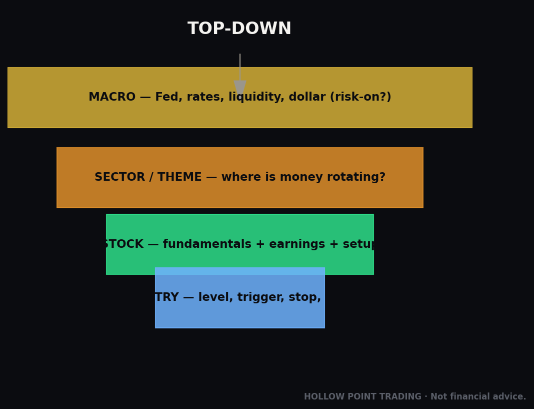
At Hollow Point, we don't start with the candle. We start at the top and work down: macro, then sector, then stock. That means: first, what's the overall market doing — is it a broadly healthy, rising market or a fearful, falling one? Second, what's the sector doing — is the industry this stock lives in strong or weak? Only then do we zoom in to the individual stock and its candles. A beautiful bullish engulfing on one stock means far more when the whole market and its sector are also leaning up. Candles are the last, most precise layer — not the first.
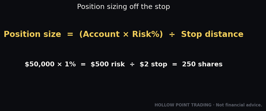
Second, and this is the heart of everything we teach: discipline over prediction. Candles don't let you predict the future, and anyone who says otherwise is fooling you or themselves. What candles give you is a way to define your risk clearly. Remember our hammer, where buyers defended the $66 low with a long wick? That $66 low is now a logical line in the sand. If you decided to buy expecting a bounce, and price instead broke back below $66, the story you read is proven wrong — the buyers who defended it failed. That's your signal to get out with a small loss. That exit price is called a stop-loss — a predetermined price where you admit you're wrong and protect your capital. The candle gave you that level. That's the real gift.
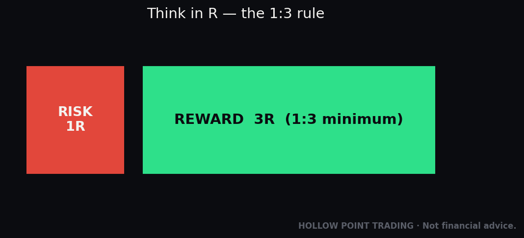
This connects to the rule that governs every position we take: risk 1 to make 3 — often written as 1:3 reward-to-risk. In plain English: only take a trade where the amount you'd lose if you're wrong (the distance to your stop-loss) is at most a third of the amount you'd gain if you're right. If your stop is $1 below your entry, your target should be at least $3 above it. This way you can be wrong more often than you're right and still come out ahead over time, because your wins are three times the size of your losses. Candles help you find precise, logical spots for both your entry and your stop — which is exactly what makes that math possible.
And above all of it sits the first rule of Hollow Point: protect your capital first. You cannot trade tomorrow if you blow up your account today. Candles are not a crystal ball for getting rich quick. They are a tool for reading the fight in front of you clearly, defining exactly where you're wrong, and risking small to make more. Learn them for that, and they'll serve you for a lifetime.
Your Monday morning: what to actually do
You don't need to trade anything this week. Here's the assignment that turns this from reading into skill. Open any free charting website. Pull up any well-known stock on the daily timeframe. Then, one candle at a time, practice out loud:
"Green or red? Big body or small? Long wick where? What's the story — who won this day, and did they win easily or barely?"
Do that for twenty candles a day for a week. Find one doji. Find one hammer. Find one engulfing. Say what the bigger trend around it is. That's it. You are training your eye to see the fight instead of the noise. The patterns and the profits come later — the reading comes first, and now you know how.
The candle never lies about what already happened. It shows you the tug-of-war exactly as it played out — the pushes, the failures, the winner. Your job as a beginner isn't to predict the next candle. It's to read this one honestly, know where you'd be wrong, and never risk more than you can afford to lose finding out. Do that, and you're already trading like a professional in the one way that matters most: with discipline.
Bound by rules, feared by trade.