
Here's the trade almost everyone loses: they pull up a chart, see a clean setup — a bull flag, a golden pocket bounce, a double bottom — and they buy it. The pattern was real. The line was pretty. And it still went against them.
Why? Because a chart is a picture of one thing. And that one thing is a passenger inside a much bigger machine. The stock is riding inside a sector. The sector is riding inside the broad market. The broad market is riding inside a macro regime set by the Federal Reserve, interest rates, and the flow of money through the whole system. When you trade a chart in isolation, you're reading the passenger's face and ignoring the fact that the whole train is heading off a cliff.
The traders who win consistently do the opposite. They start wide and narrow down. Macro first. Then the sector. Then the stock. Then — and only then — the entry. The chart is the last thing they look at, not the first. And once they're inside a theme, they don't stop at the one obvious name everybody's watching. They walk the entire chain of companies that theme feeds, because one story usually creates a dozen tradable names most people never think to pull up.
This is the flagship method at Hollow Point Trading. It's called the top-down funnel, and by the end of this piece you'll be able to run it yourself — on any name, in any market regime, at any time of the cycle. We're going to build it slowly, with real numbers, real chains of companies, and the exact order of operations the pros run without even thinking about it anymore. Let's build it.
The Core Concept: A Chart Is an Effect, Not a Cause
A stock price is an output. It's the last number in a long chain of causes. Money has to want to be in risk before it wants to be in stocks. Then it has to want to be in this sector before it flows into this stock. By the time a pretty pattern shows up on your screen, three or four bigger decisions have already been made upstream — and if any of them reverse, your pattern breaks no matter how clean it looked.
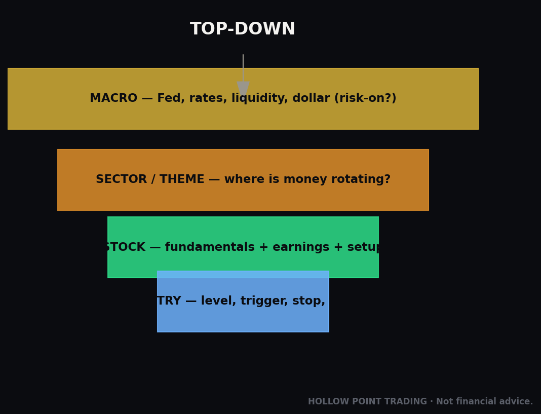
Think of it as a funnel with four levels:
- Macro — Is the environment risk-on or risk-off? What are rates, the Fed, liquidity, and the dollar doing?
- Sector / Theme — Is money rotating into this group, or out of it?
- Stock — Do the fundamentals and the calendar (earnings, catalysts) support the trade, and is the technical setup actually there?
- Entry — Only now do you time the trade with your levels and your risk.
Most people skip straight to step four. They live their whole trading life at the bottom of the funnel, wondering why "good setups" keep failing. The setups aren't the problem. The context is.
Here's the mental model that makes it click: the market is a weather system. Macro is the climate. The sector is the season. The stock is the day's forecast. The chart pattern is what you see out the window right now. You can be looking at a sunny window inside a hurricane. The window isn't lying to you — it's just not the whole picture. A trader who only knows the window will get soaked over and over and never understand why, because the window was genuinely sunny each time. The problem was never the window. It was the altitude he refused to climb to.
The three things a chart cannot tell you
It helps to be brutally specific about what a chart, all by itself, is blind to. A price chart shows you what has happened to the price. It cannot show you three things that matter enormously:
- Why the money is here. A rising 20-day EMA and a series of higher lows tells you buyers showed up. It does not tell you who they were, whether they're institutions building a position over weeks or day-traders chasing a headline for an afternoon. Those two flows look identical on the candles and behave completely differently the next morning.
- Whether the money is staying. A chart is a rear-view mirror. Rotation — money leaving a group — often begins while the chart still looks fine, because big positions get sold into strength, not weakness. The first sign is relative underperformance, not an ugly candle. By the time the candle is ugly, the smart money is mostly out.
- When the ground is about to move. Earnings, an FOMC decision, a CPI print, a supplier's guidance cut — these are scheduled events that can gap a stock 15% overnight straight through your stop. The chart gives you no warning at all. The calendar does.
Everything the top-down funnel adds is really just a way of restoring the information the chart structurally cannot contain. You're not replacing technical analysis. You're giving it the context that makes it trustworthy.
The Mechanism: Why Money Moves Top-Down
Understanding why the funnel works matters, because it stops you from treating it as a superstition and lets you adapt it when conditions are weird.
Big money is allocated top-down by design. Pension funds, hedge funds, and institutions don't wake up and buy a random stock. They decide, first, how much risk to hold at all — stocks versus bonds versus cash. That decision is driven by macro: rates, growth, inflation, liquidity. Then they decide where inside stocks — which sectors, which themes. Only at the end does a specific name get bought. Since institutions move the majority of real volume, price follows their sequence: macro decision, then sector decision, then the individual buy. You're just reading the funnel they already walked. You are not smarter than the institutions. You are downstream of them, and the funnel is how you stay in their current instead of fighting it.
Rates set the price of everything. When the Fed cuts rates or floods the system with liquidity, cash gets cheaper and future profits get more valuable — that's risk-on, and money flows out into stocks, especially growth and speculative names. When the Fed hikes or drains liquidity, cash pays you to sit still, borrowing gets expensive, and money retreats to safety — risk-off. This is the single biggest switch in the whole machine. Here's the deeper mechanism most people never internalize: a growth stock's value comes mostly from profits it hasn't earned yet, years out in the future. Higher rates discount those future profits harder — a dollar earned in 2032 is worth less today when rates are 5% than when they're 1%. That's why the most speculative, longest-duration names get hit hardest when yields spike, and why they scream loudest when yields fall. A high-growth tech name fighting a hawkish Fed is swimming upstream, and most swimmers drown.
The dollar is the world's plumbing. A strong dollar (measured by DXY) tightens global conditions, pressures commodities and emerging markets, and often headwinds multinationals whose overseas revenue converts back into fewer dollars. A weak dollar loosens things and tends to lift risk. You don't need to trade the dollar to respect it — you just need to know which way it's leaning, because it quietly tilts the odds under everything else.
Sectors rotate on a cycle. Money is never evenly spread. It concentrates in whatever theme is working and abandons what isn't. This is rotation, and it's visible: when defensives (utilities, staples, healthcare) lead, the market is nervous; when cyclicals and tech lead, it's confident. If you're long a semiconductor name while money is fleeing tech for utilities, the chart can be perfect and you'll still bleed, because the tide is going out under you.
Correlation tightens exactly when you need it to loosen. In calm markets, individual stocks trade on their own stories. In stress, everything correlates to one — when the VIX spikes, the machine stops caring about your specific name and sells everything that isn't a Treasury. This is why the funnel gets more important, not less, in high-volatility regimes. When correlation is high, the macro and sector gates are doing almost all the work and the individual chart is nearly noise.
The funnel works because it matches the actual order in which capital gets deployed. You're not predicting — you're aligning.
Step by Step: How to Run the Funnel (with Worked Numbers)
Let's walk it top to bottom with a concrete, numeric example so you can see each gate open or close. We'll use a semiconductor swing trade as the spine and then, later, stress-test the same setup in different regimes to show how the context flips the decision without the chart changing at all.
Step 1 — Read the Macro Regime
You're not forecasting the economy. You're answering one question: is money in a mood to take risk right now? A quick checklist:
- Fed / rates direction. Cutting or on hold with a dovish lean = tailwind for risk. Hiking or hawkish = headwind. Watch the 10-year Treasury yield: falling yields generally help growth stocks; rising yields pressure them.
- Liquidity. Is the system flush or draining? Credit spreads (junk bonds vs. Treasuries) tell you: tight spreads = calm, wide-and-widening = stress. A quick proxy is the HYG or JNK high-yield ETF — when it's rolling over while stocks are still up, credit is flashing a warning the equity crowd hasn't priced yet.
- The dollar (DXY). Falling or flat = supportive of risk. Ripping higher = a warning.
- Volatility (VIX). Below ~15–17 and calm = risk-on. Spiking above 20 and rising = risk coming off. It's not just the level — it's the direction. A VIX at 18 and falling is very different from a VIX at 18 and climbing.
- Market internals. Is the S&P 500 (SPY) above or below its rising 50- and 200-day moving averages? Above and rising = uptrend regime. Below and falling = don't force longs. Breadth matters too: are most stocks participating, or is the index being held up by five names while everything underneath quietly bleeds?
Worked read: Say the 10-year yield is drifting down from 4.6% to 4.2%, the Fed just signaled a pause with cuts on the horizon, DXY is soft, VIX sits at 14, and SPY is riding above a rising 50-day. That's a green macro light. Risk-on. Longs are with the wind.
If instead VIX were 26 and rising, DXY breaking out, yields spiking, and SPY under a falling 50-day — you'd downshift. Smaller size, tighter stops, or simply stand aside. Same chart setup, completely different odds. The macro regime is a position-size dial before it's anything else.
The macro dial in practice: three settings, not two
Beginners treat macro as a binary — risk-on or risk-off. Pros run it as a dial with at least three settings, because most of the time the tape is neither clean-green nor clean-red:
- Green (full size). Multiple macro signals aligned and pointed the same way: yields easing, VIX low and calm, SPY trending, breadth healthy. This is when you press. Full risk, hold winners longer, let the trend pay you.
- Yellow (half size, tighter). Mixed signals — SPY still up but breadth thinning, or VIX low but creeping, or yields chopping sideways at a decision point. Most of the year lives here. Cut size, take first targets faster, don't hold through events.
- Red (stand aside or shorts only). Signals aligned against risk: VIX spiking, credit spreads widening, SPY losing its 50-day on volume, dollar ripping. Longs are a low-percentage bet no matter how clean the chart. This is when the funnel saves you the most money — by keeping you out.
The honest truth is you'll spend most of your time in yellow, and the skill is being comfortable trading small there rather than pretending it's green because you want to be in a trade.
Step 2 — Find Where the Money Is Rotating
Now, which group is getting the flow? The fastest tool is relative strength: compare a sector ETF to the S&P 500 and ask if it's outperforming.
Pull up the semiconductor ETF (SMH) against SPY. If SMH is up 8% over the last month while SPY is up 3%, semis are leading — that's a relative-strength ratio rising, and it means money is rotating into chips faster than into the market as a whole. That's your season. Now you want to be shopping in that aisle, not fighting it.
The cleanest way to see this is a literal ratio chart — SMH/SPY plotted as its own line. When that line is making higher highs and higher lows, the sector is winning the fight for capital regardless of whether the whole market is up or down on the day. A rising ratio in a flat market is one of the strongest tells there is: money is actively choosing this group.
Confirm it two ways:
- Breadth within the group. Are most of the names in the sector rising together, or is one stock carrying a dead group? Broad participation = a real theme. One name alone = a story, not a rotation. Pull up eight or ten names in the group and eyeball them fast — if seven are trending up and three are basing, that's a rotation. If one is vertical and nine are flat, that's a single-stock story wearing a sector costume.
- Is it early or late? A theme that's been running for months and is stretched far above its moving averages is later-stage — chase carefully. A theme just breaking out of a long base is earlier and cleaner. The best entries come when a group has been ignored for months, quietly bases, and the ratio line turns up before the crowd notices.
Worked read: Macro is green. SMH is outperforming SPY, and it's not just one chip — networking names, memory names, and equipment names are all lifting together. That's a real rotation into the whole AI/semiconductor complex. Two gates open. Now, and only now, do we go looking for a stock.
Reading rotation out — the warning you get for free
Rotation is a two-way street, and the exit signal is worth as much as the entry signal. If you're long a semi name and the SMH/SPY ratio quietly rolls over — SMH now lagging SPY on up days and leading on down days — that's the tide going out, even if your stock's own chart still looks okay. The ratio turns before the individual candles do, because the big holders sell into strength. Treat a broken sector ratio as a reason to tighten stops or take partials, days before the price chart would have told you anything was wrong. Many of the best "how did you get out at the top?" exits are nothing more exotic than watching the group's relative strength fail while the stock was still green.
Step 3 — Pick the Stock: Fundamentals + Calendar + Setup
Inside a leading sector, you still have to choose a name and vet it on three fronts.
Fundamentals — is this a leader or a laggard? You don't need a CFA. You need to know: is revenue growing, are margins healthy or expanding, and is the company a price-setter in its niche or a price-taker getting squeezed? In a hot theme, favor the names with real earnings power and pricing leadership. The junk rips too, but it round-trips hardest when the theme cools. A useful shortcut: in the early innings of a theme, the leaders lead and the junk lags; in the late, blow-off innings, the junk goes vertical while the leaders stall. Which names are moving tells you what inning you're in.
The calendar — this is where most people get ambushed. Every stock has an earnings date, roughly every 90 days. On that day, the stock can move 10–20% in seconds, and no chart pattern survives a surprise. Before you take any swing trade, you must know when the company reports. Buying a "clean breakout" two days before earnings isn't a trade — it's a coin flip with your stop turned off. And it's not just the stock's own date. Map the chain's calendar: the foundry that makes its chips, the biggest customer that buys them, the sector bellwether whose print drags the whole group. Any of those can move your name on a day you thought was quiet.
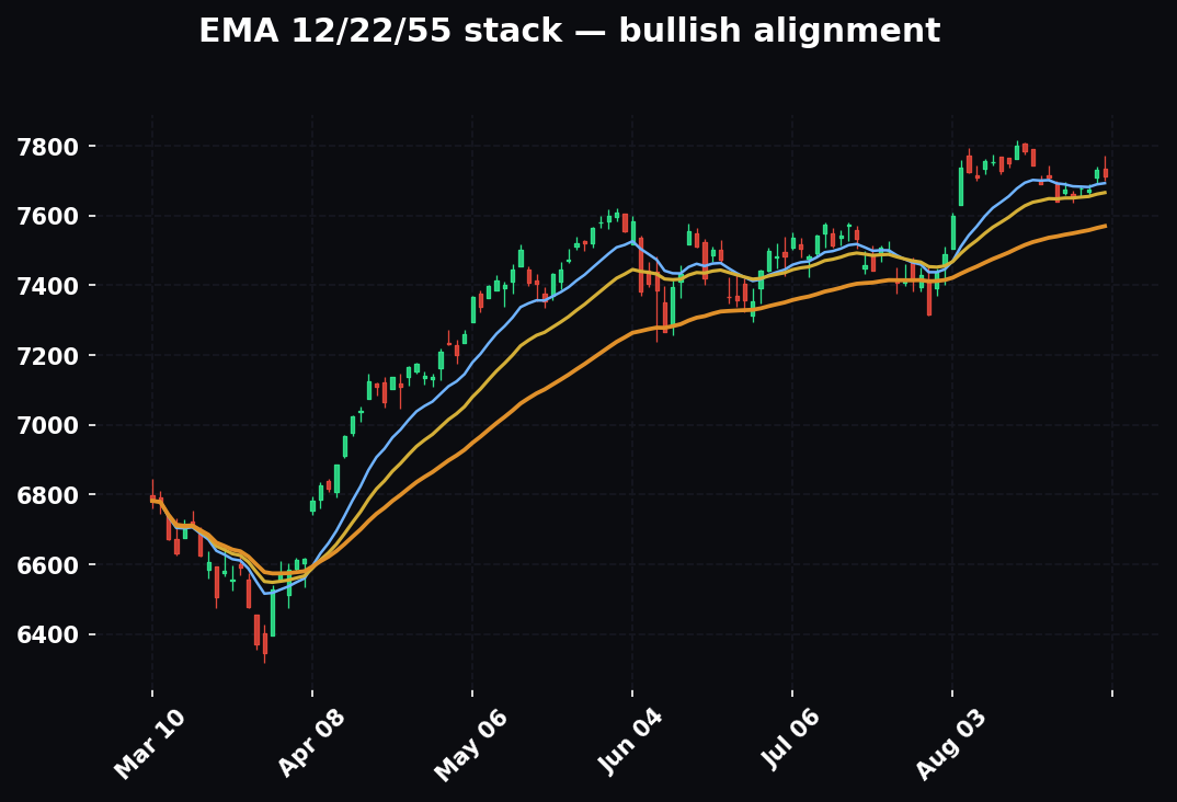
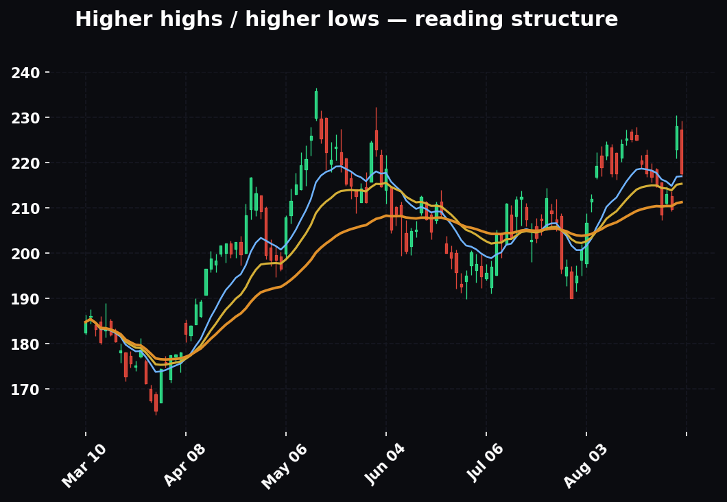
The setup — now, finally, the chart. Structure (higher highs and higher lows for an uptrend), the moving-average stack (price above rising EMAs), a level worth trading against, and a clear line that says I'm wrong below here. The chart's only job at this stage is to give you a precise entry and a precise invalidation so you can size the risk. Notice the demotion: by the time you're reading candles, three bigger questions are already answered. The chart isn't the reason for the trade. It's the instrument panel for a trade the context already justified.
Worked read: Inside the leading semi group, you like the primary chip name. Revenue is compounding, margins are fat, it's the clear leader. It reports earnings in eight days — noted, that's a hard deadline on any swing. Technically it's pulling back into its rising 20-day EMA at $118, holding a prior breakout shelf. You define the trade: entry $118, stop $112 (below the shelf), first target $136.
Step 4 — Size It on 1:3 and Only Then Click
Do the risk math before the entry, not after.
- Risk per share: $118 − $112 = $6.
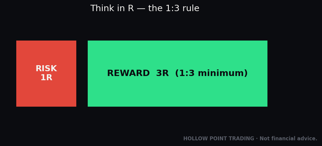
- Reward to first target: $136 − $118 = $18. That's $18 of reward against $6 of risk, exactly 1:3. It clears HPT's minimum. Trade qualifies.
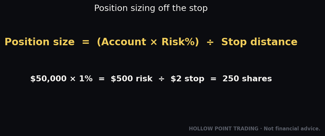
- Position size on a $50,000 account risking 1% ($500): $500 ÷ $6 = ~83 shares. That's a $9,800 position controlled by a $500 defined loss.
Notice what happened: the chart was the last input, and the risk math was the gate that let the click happen. Macro told you longs were live. Rotation told you which aisle. Fundamentals and the calendar told you which name and how much time you had. The chart just gave you the numbers. If macro had been red or the sector had been bleeding, that same $118 pullback is a trap, and you'd have passed. Same pattern, different context, opposite decision. That's the entire edge.
Why 1:3 is a filter, not just a rule
The 1:3 minimum does more than manage a single trade — it silently filters which trades you take. A setup that only offers 1:1.5 to a logical target is telling you something: either your stop is too far (the level is loose) or your target is too close (the move is late). Trades that naturally offer 1:3 or better tend to be the ones caught early, against a tight level, with room to run. So the ratio isn't an arbitrary tax on your entries. It's a screen that pushes you toward better-timed, better-located trades and away from the crowded, late ones. Over a hundred trades, a trader who only takes 1:3-or-better setups can be wrong more often than right and still make money, because the winners pay three-to-one. That math is the whole reason discipline beats accuracy.
The Same Trade in Three Regimes
The single most useful exercise in this whole method is to take one setup and run it through different macro weather, because it shows you that the setup is not the decision. Let's take that exact $118 semi pullback and change nothing about the chart — only the world around it.
Regime A — Clean trend, risk-on (green)
Yields easing, VIX 14 and calm, SPY trending above a rising 50-day, SMH/SPY ratio making new highs. This is the setup as written: full size, 83 shares, hold for the $136 first target and trail the rest. In a trending, risk-on tape, pullbacks to the rising 20-day get bought, breakouts follow through, and you can afford to give winners room. This is when you press.
Regime B — Chop, mixed signals (yellow)
SPY going sideways in a range, VIX 17 and flat, breadth mediocre, the SMH ratio wobbling near its highs but not confirming. The chart looks identical, but the tape's character has changed: breakouts fail and reverse, pullbacks overshoot, and the "clean" $118 shelf may get undercut to $115 to shake people out before it works — if it works at all. In chop, you do three things differently. You cut size (half, ~40 shares). You take the first target faster and don't expect the trend leg — range tops become resistance, so $130–$132 might be all you get. And you respect that your stop is more likely to get tagged on noise, so either widen it slightly and cut size to compensate, or wait for a tighter trigger. Many good trend traders bleed out in chop precisely because they trade it the same size and same targets as a trend. Same chart, different playbook.
Regime C — High-vol, risk-off (red)
VIX 28 and rising, credit spreads widening, DXY breaking out, SPY under a falling 50-day, and the semi ratio rolling over. Now that beautiful $118 pullback is a trap. In a risk-off tape, correlation goes to one — the machine sells your name not for anything it did but because it's selling everything. The shelf that would hold in a calm market gets sliced. Gaps go against you overnight. The honest read here is: no trade. If you're determined to be active, the higher-percentage expression of the same view is a short on a failed bounce into resistance, not a long into a knife. The funnel didn't just size the trade down — it told you the long was the wrong side entirely. That is the difference between a method and a pattern.
Multi-Timeframe: The Funnel Inside the Chart
The top-down idea doesn't stop at the chart — it repeats inside it. Just as macro sits above sector sits above stock, the higher timeframes sit above the lower ones, and the same rule applies: the bigger frame sets the context, the smaller frame gives the trigger.
The clean way to run it is three timeframes: one for bias, one for setup, one for trigger.
- Bias frame (the "macro" of your chart). For a multi-day swing, this is the daily. Is the daily in an uptrend — higher highs and higher lows, price above a rising 20/50 EMA? The daily sets the direction you're allowed to trade. If the daily is down, a pretty long on the 15-minute is a countertrend scalp at best, not a swing.
- Setup frame (the "sector"). Drop to the hourly or 4-hour. This is where you find the pullback, the shelf, the level to trade against. It should agree with the bias frame — a pullback on the hourly inside a daily uptrend is exactly the alignment you want.
- Trigger frame (the "entry"). The 5- or 15-minute gives you the precise entry: a reclaim of a level, a failed breakdown, a momentum shift. This is where you get a tight stop, which is what makes the 1:3 math work.
When all three point the same way — daily up, hourly pulling back into support, 5-minute reclaiming — that's a timeframe alignment, the chart-level version of macro-sector-stock all being green. When they conflict — daily up but hourly breaking down — you either wait or you size down, exactly like a yellow macro light.
The mistake is inverting the hierarchy: falling in love with a 5-minute pattern and ignoring that the daily is rolling over. The 5-minute is the passenger; the daily is the train. Same principle, one level down.
Confluence: Stacking the Funnel With Other Tools
The funnel isn't meant to run alone. Its output — a defined-risk trade aligned with the regime — gets stronger when independent tools agree with it. The key word is independent. Three tools that all measure the same thing aren't confluence; they're one opinion in three costumes. Real confluence is when tools that measure different things point at the same price.
Confluence tool 1 — Relative strength (which we've already met)
The sector ratio is your first confluence layer, and it's independent of the chart pattern because it measures flow, not shape. A bull flag on a name whose sector ratio is rising is a very different trade than the identical flag on a name whose sector is bleeding. The pattern is the same; the flow underneath it is opposite.
Confluence tool 2 — Fibonacci and the golden pocket
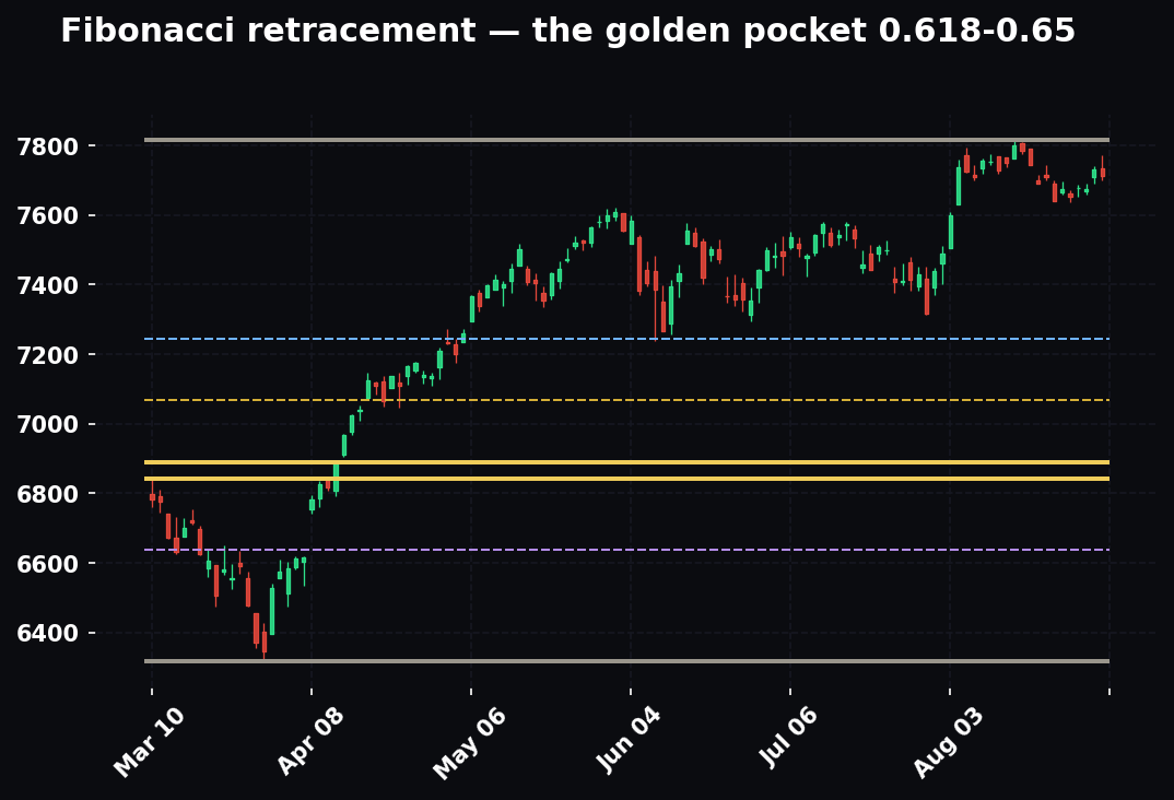
Fibonacci retracements answer a question the funnel doesn't: where, precisely, is the pullback likely to end? Draw the fib on the impulse leg that created the trend. The golden pocket — the 0.618 to 0.65 retracement zone — is where trend pullbacks most often find buyers. Now stack it: if your $118 EMA shelf also sits in the golden pocket of the last leg up, you have two independent tools (a moving average and a fib ratio) pointing at the same price. That's confluence. If the golden pocket sits at $118 and the rising 20-day EMA is at $118 and the sector ratio is rising and macro is green, you're not hoping — you're stacked.
Confluence tool 3 — Volume and volume profile
Volume tells you whether the move is real. A breakout on triple average volume is institutions; a breakout on thin volume is a fake waiting to reverse. Volume profile adds the where: the point of control (POC) is the price with the most traded volume, and it acts like a magnet and a shelf. When your entry level lines up with a high-volume node — a price the market has already agreed is "fair" and defended before — that's a third independent vote. When your $118 entry is the POC of the last two weeks and the golden pocket and the rising EMA, you have shape, ratio, and participation all agreeing.
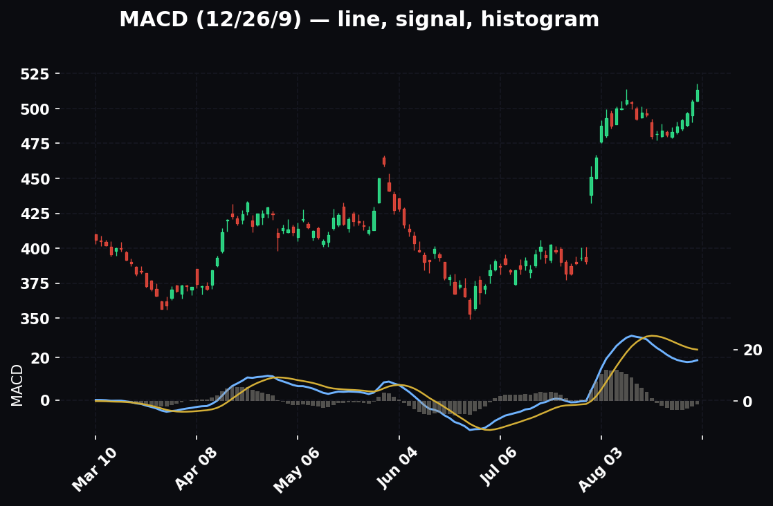
The rule of thumb: require at least three independent confluences pointing the same way, and require them to be genuinely independent. Two EMAs crossing plus a MACD cross plus an RSI turn is not three votes — they're all momentum, all derived from the same price, all saying one thing. A fib level, a volume node, and a sector ratio are three different measurements. That's the confluence that holds up.
Think Outside the Chart: One Theme, Dozens of Names
Here's the part Blake cares about most, and where the real money hides. Once you've identified a theme, the biggest mistake is trading only the one obvious stock. A theme isn't a ticker. It's an ecosystem, and it pays many layers.
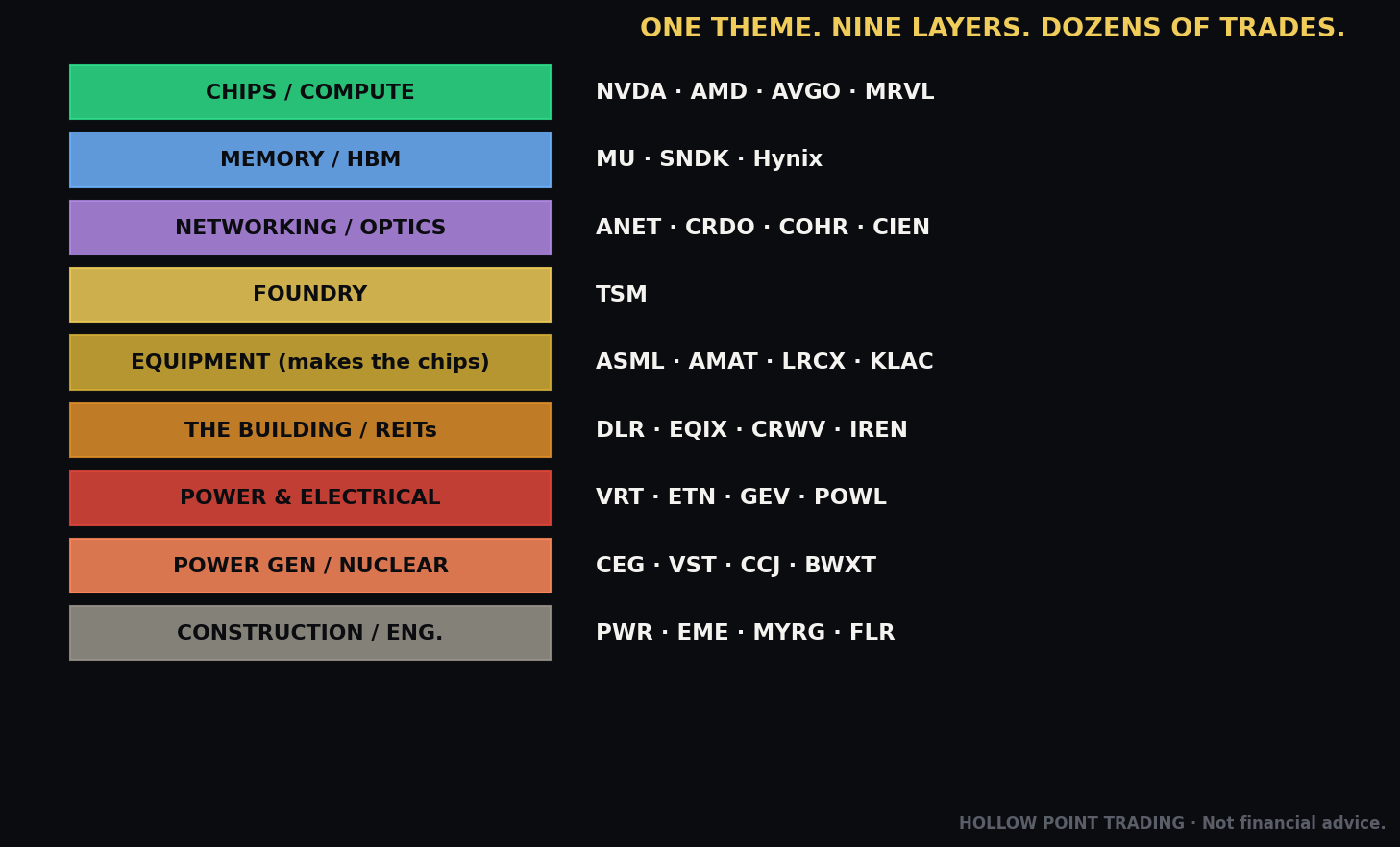
The AI/data-center buildout is the master example of our era, so let's walk the whole chain. When people say "the AI trade," they mean one chip company. But that chip has to be designed, manufactured on machines someone else builds, fed with memory and networking, housed in a building someone constructs on land someone owns, and powered and cooled by an electrical grid that can barely keep up. Every one of those layers is a set of public companies. Every one has winners and losers. Most people never pull up a single one of them.
It's not just chips — it takes things to make them, power to run them, buildings to house them, and people to build all of it. Walk it layer by layer:
- Compute (the brains). The headline GPUs (NVDA, AMD) plus the custom ASICs that hyperscalers design to cut their reliance on them (AVGO, MRVL). When a cloud giant builds its own chip, that's a loser signal for the merchant GPU and a winner for the ASIC partner. Same theme, opposite trades.
- Memory / HBM (the short-term memory). Every AI accelerator needs stacks of high-bandwidth memory. That's a tight oligopoly: MU, SK Hynix, Samsung, plus storage in SNDK/WDC. When AI demand spikes, memory pricing can swing violently — a leveraged play on the same story.
- Networking / optics (the nervous system). Thousands of chips have to talk to each other at light speed. That's switches and optical interconnects: AVGO, ANET, CRDO, ALAB, COHR, LITE, CIEN. This layer often moves harder than the chip on the same news, because it's less crowded.
- Foundry (the factory). Almost every advanced chip is physically made by one company: TSM. It's a chokepoint the entire theme flows through.
- Semicap equipment (the machines that make the chips). Before you can make a chip, you need the machines that make it. This is the "picks and shovels beneath the picks and shovels": ASML (the only maker of the extreme-ultraviolet lithography machines), AMAT, LRCX, KLAC, TER, ONTO, ENTG. Demand for chips becomes demand for these machines with a lag.
- EDA / IP (the blueprints). The software and licensed designs every chip is built from: SNPS, CDNS, ARM. Toll booths on the whole industry.
- The building and the land. Data centers are physical real estate: REITs DLR and EQIX, and the "neoclouds" renting out GPU capacity — CRWV, NBIS, IREN, APLD.
- Power and electrical (the grid can't keep up). This is the layer most chart-watchers completely miss. A data center is a giant electricity consumer, and the grid is straining. Power distribution, cooling, and electrical infrastructure: VRT (power and cooling), ETN, GEV, POWL, NVT, nVent.
- Cooling. All that compute throws off enormous heat. Liquid cooling and thermal management — VRT again, and the specialists — become a bottleneck of their own.
- Power generation (someone has to make the electricity). Independent power producers and nuclear: CEG, VST, TLN, NRG. Uranium miners: CCJ, UEC. Small modular reactors: BWXT, OKLO. The AI story quietly became an energy story.
- Construction and engineering (who literally builds it). Someone has to pour the concrete, run the conduit, and wire the substations: PWR (Quanta), EME (EMCOR), MYRG, FLR. These are boring names that turned into some of the theme's biggest movers precisely because nobody was watching them.
That's roughly forty tradable tickers from a single theme. When the story is hot, the flow doesn't stay in the chip — it spills down the chain, often in waves. And crucially, there are losers at each layer too: the merchant chipmaker that gets designed out by an ASIC; the memory maker caught in a pricing glut; the equipment name that just booked a customer's capex cut. Thinking in systems gives you longs and shorts.
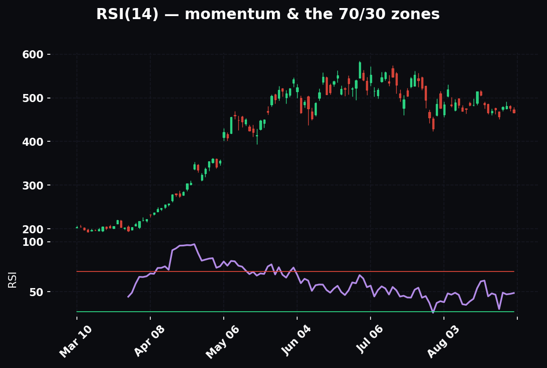
The wave pattern: how flow spills down the chain
The layers don't all move at once — they move in a rough sequence, and knowing the sequence is a trade. The pattern tends to be: the headline compute name moves first on the story. Then the direct suppliers — memory, networking, foundry — catch up over the following days and weeks as analysts connect the obvious dots. Then the second-order layers — power, cooling, generation, construction — move last and slowest, sometimes a quarter or two behind, because their revenue connection is real but lagged. The edge for a system-thinker is to be early to the later layers: when the chip has already tripled and everyone's crowded into it, the construction and power names may not have moved at all despite being mechanically tied to the same demand. You're not chasing the crowded trade. You're front-running the wave into the un-crowded layer.
How to build your own chain for any theme
This isn't only about AI. The reflex generalizes. For any theme, ask the same five questions and you'll build the chain:
- What's the headline product? (the obvious name everyone trades)
- What goes into making it? (suppliers, components, raw materials)
- What machines or tools make it? (the picks-and-shovels layer)
- What does it need to run or exist? (power, real estate, logistics, infrastructure)
- Who builds and services all of the above? (construction, engineering, maintenance)
Run those five questions on weight-loss drugs, on electrification, on reshoring, on defense — every big theme has a chain, and every chain has un-crowded layers and clear losers. The AI chain is just the richest current example. The method is what you keep.
Connect the Dots: What One Earnings Report Really Tells You
Here's the skill that separates system-thinkers from chart-watchers. A single report from the biggest name in a chain is a data drop about the entire chain — if you know how to read the connections.
Say the flagship AI chipmaker reports blowout earnings and, more importantly, raises guidance and says demand is still outrunning supply. The obvious move — buy the chipmaker — is already priced in seconds after the print. The edge is asking: what does this imply for everyone up and down the chain, before those names have caught up?
- Memory (MU): If chip volumes are surging, every one of those chips needs HBM. Bullish read for memory. Check MU's own earnings date so you're not blindsided, then look at its chart with a tailwind.
- Networking (AVGO, ANET): More accelerators shipped means more switches and optics to connect them. The networking layer gets pulled along.
- Foundry (TSM): Every one of those chips is fabricated at the foundry. Strong chip demand is strong foundry demand. TSM's own report a few weeks later becomes a confirmation checkpoint.
- Equipment (ASML, AMAT, LRCX): If the foundry has to expand capacity to keep up, it orders more machines. This layer moves on a lag — the read isn't for today, it's for the next quarter or two.
- Power and cooling (VRT): More chips running means more data centers drawing more power and throwing more heat. Bullish for the electrical and cooling layer.
- Power generation (CEG, VST): More data centers online means more electricity demand contracted years out. The nuclear and IPP names are the long tail of the same sentence.
- Construction (PWR): Someone builds all those new facilities. The engineering firms are the last, slowest, and most-overlooked domino.
One report, ten-plus informed reads across the chain. You don't chase the chip everyone already bought. You rotate to the layer that hasn't moved yet but is mechanically tied to the same demand. That's connect-the-dots trading, and it's hiding in plain sight every earnings season.
Read the guidance, not the headline number
There's a subtlety that catches people. The headline EPS beat or miss is the least useful part of an earnings report for connect-the-dots purposes, because it's backward-looking and already half-priced. The gold is in the guidance and the commentary: what management says about future demand, capacity, pricing, and spending. A chipmaker that beats on the quarter but guides down on next quarter is a bearish pulse down the chain even though the headline was green — and the first red candle on the suppliers won't appear until the crowd digests it. Conversely, a modest beat paired with "demand continues to exceed supply and we're expanding capacity" is a bullish pulse for equipment and foundry regardless of the print. Read the sentence about the future, then trace it down the chain.
The reverse: reading the leak in the pipe
The reverse works as a warning. If a major cloud buyer says on its call that it's cutting capital spending, that's a leak in the pipe. Fewer data centers means fewer chips, less memory, less networking, less power, less construction — a bearish pulse down the entire chain, days before those charts roll over. The chart-watcher sees a red candle appear from nowhere. The system-thinker saw the customer's call and was already out. This is why mapping the whole chain's calendar matters: the report that hurts your stock most may not be your stock's report at all. It may be its biggest customer's, three days earlier.
How the Pros Use This Differently From Beginners
The funnel is the same tool in everyone's hands. What changes is how it's held. Here's where the gap actually lives.
Beginners look for reasons to enter. Pros look for reasons to pass. A beginner runs the funnel hoping every gate turns green so they can trade. A pro runs it hoping to disqualify the trade cheaply, because the trades that survive a genuine attempt to kill them are the good ones. Most of a pro's funnel runs end in "no."
Beginners treat macro as a binary. Pros treat it as a dial. We covered this — the pro is comfortable trading small in yellow and flat in red, while the beginner forces full size in every condition because being in a trade feels like working.
Beginners trade the obvious name. Pros trade the un-crowded layer. Given a hot theme, the beginner buys the headline chip at the top of the wave with the whole world. The pro has already mapped the chain and is positioning in the power or construction layer that hasn't moved yet, with better risk-reward and less crowding.
Beginners react to earnings. Pros pre-map the calendar. The beginner discovers earnings the morning after they gap through his stop. The pro knew the date before entering, sized for it, and either closed before the print or deliberately held a defined-risk position into it as a separate decision.
Beginners manufacture confluence. Pros demand independence. The beginner decides he likes a stock, then stacks five momentum indicators that all say the same thing and calls it conviction. The pro requires three different kinds of evidence — flow, level, participation — and gets suspicious when everything agrees too easily.
Beginners have one position size. Pros have a size for every regime. The pro's size is an output of the funnel — full in green, half in yellow, zero in red. The beginner's size is an output of how excited he is, which is exactly backwards, because excitement peaks at tops.
Beginners fall in love with the trade. Pros fall in love with the process. The beginner's identity is tied to the position being right. The pro's identity is tied to running the funnel correctly, which means a stopped-out trade that was properly vetted is a success — the process worked, the risk was defined, the loss was small. Outcome and process are different scorecards, and the pro keeps them separate.
Beginners think the chart is the analysis. Pros know the chart is the last 10%. By the time a pro looks at candles, 90% of the decision is made. The chart just supplies the entry and the invalidation. The beginner spends 90% of his time on the chart and 10% on everything that actually determines the outcome.
The Mistakes People Make
Every one of these comes from looking at a single chart instead of the machine around it. Read them as a pre-trade checklist of ways to get hurt.
1. Trading a chart without knowing the earnings date. The most expensive rookie error. You take a beautiful breakout, and 48 hours later the company reports and gaps 15% against you through your stop. No pattern survives a surprise. Always know when the name reports before you hold it, and treat the days right before earnings as a no-new-swings window unless you're deliberately trading the event with defined risk.
2. Ignoring a supplier's or customer's report. Your stock isn't reporting this week — but its biggest customer is, or its sole foundry is, or the sector bellwether is. Those reports move your name whether it's "your turn" or not. Map the calendar for the whole chain, not just your ticker.
3. Missing sector rotation. Being long a perfect chart in a group money is fleeing. The tide beats the swimmer every time. Check the sector's relative strength ratio before you trust any setup, and treat a rolling-over ratio as an exit signal even when the stock's own chart still looks fine.
4. Not knowing the macro regime. Forcing long trades into a hawkish, risk-off tape. The setups "stop working" and traders blame themselves, when the truth is the climate turned and they never looked up. Check the dial before the chart, every time.
5. Trading only the obvious name. Buying the one chip everyone talks about while ignoring the memory, networking, power, and construction names quietly making the bigger, cleaner moves with less crowding. Build the chain and shop the un-crowded layers.
6. Manufacturing confluence. Deciding you like a stock, then hunting for reasons. Real confluence is top-down and independent: macro and sector and fundamentals and the chart pointing the same way, measured by different tools. If you had to squint to find the third reason, it isn't there.
7. No defined invalidation. Entering without the exact price that says you're wrong. Without it, you can't size the trade, and you can't enforce 1:3. "I'll know it when I see it" is not a stop — it's how small losses become account-ending ones.
8. Trading the same size in every regime. Full size in chop, full size into events, full size in a risk-off tape. Size is supposed to be an output of the funnel. When it's a constant, the funnel isn't actually driving your decisions.
9. Inverting the timeframe hierarchy. Falling in love with a 5-minute pattern while the daily rolls over. The lower frame is the passenger; the higher frame is the train. Let the big frame set direction and the small frame set the trigger, never the reverse.
10. Chasing the late stage of a theme. Buying the theme after it's up 300% and stretched far above every moving average, because that's when it's finally obvious. The clean entries are early — a group basing while ignored, the ratio just turning up. By the time it's on magazine covers, you're the exit liquidity.
11. Reading the headline number instead of the guidance. Trading the EPS beat/miss and missing that management guided the future the other way. The forward commentary is the part that moves the chain; the print is already half-priced.
12. Confusing a good process with a good outcome. Judging a properly vetted, stopped-out trade as a failure and a reckless win as skill. Over a large enough sample, process is what pays. If you only keep score by outcome, you'll unlearn the exact discipline that makes you money.
Frequently Asked Questions
Do I really have to run all four steps for every trade? That sounds slow. Once it's a habit, the macro and sector read takes two minutes because you're already carrying it in your head from the morning — the regime doesn't change tick to tick. You're not re-deriving the climate for every trade; you're checking that nothing flipped. The stock and entry work is where your time goes. The funnel feels slow for the first month and then becomes the fast part, because it kills bad trades before you waste an hour building a thesis around them.
What if macro is red but I see a genuinely perfect setup? Then you trade it small, or you trade the short side, or you pass. A perfect setup in a risk-off tape has meaningfully worse odds than a mediocre setup in a risk-on tape — the context dominates the pattern. Red doesn't always mean zero, but it always means smaller and more skeptical. The whole point of the method is that the setup is not the decision.
How do I read macro without a Bloomberg terminal? Everything in the Step 1 checklist is free: the 10-year yield, DXY, VIX, and SPY versus its moving averages are all on any charting platform. Add a high-yield credit ETF for spreads. You do not need expensive data to know whether the tape is risk-on. You need five charts and the discipline to look at them before your stock.
Isn't sector rotation just a lagging indicator? By the time the ratio turns, isn't it late? The ratio leads the individual charts and lags the absolute top — which is exactly where you want it. It turns up before the crowd notices the group and turns down before the individual candles roll over. It won't catch the literal bottom or top, but it keeps you in the current and gets you out before the obvious break. That's a good trade-off.
How many names in a chain should I actually watch? Start with one representative name per layer — a compute name, a memory name, a networking name, a power name, a construction name. Five or six charts covering the whole vertical. When the theme is hot, expand into the layer that's leading. You don't need all forty on your screen; you need one window into each floor of the building so you can see which floor the money is on.
Does this work for day trading, or only swings? The principle is identical; the timeframes compress. A day trader's "macro" is the overnight and premarket tone plus the index trend on the day; the "sector" is which groups are leading on the session; the "stock" is the intraday relative strength; the "entry" is the 1- or 5-minute trigger. Same funnel, faster clock. The 1:3 discipline and the "context before chart" order don't change.
What's the single highest-leverage habit if I only change one thing? Know the earnings date — for your name and its bellwether — before every hold. It's one lookup, and it eliminates the most common account-ending surprise. If you adopt nothing else from this piece, adopt the calendar habit.
How do I keep from manufacturing confluence when I really want a trade? Write the three reasons down before you look for the fourth, and make sure they measure different things — flow, level, participation. If your three reasons are all momentum indicators, you have one reason. And ask the pro's question: what would make me pass? If you can't answer it, you're not analyzing, you're rationalizing.
The Top-Down Cheat Sheet
Run this in order, every time. If a gate is red, you shrink or skip — you don't force the next one.
1. MACRO — is it risk-on?
- 10-year yield: falling helps growth, rising pressures it
- Fed: dovish/pausing = tailwind; hawkish/hiking = headwind
- DXY: soft = supportive; ripping = warning
- VIX: <17 calm = risk-on; >20 rising = risk-off; watch direction, not just level
- Credit spreads (HYG/JNK): tight = calm; widening = stress
- SPY vs. rising 50/200-day + breadth: above and broad = uptrend regime
- Output: a position-size dial — full (green) / half (yellow) / stand aside (red)
2. SECTOR — where's the money going?
- Sector ETF relative strength vs. SPY (rising ratio = inflow)
- Breadth: is the whole group moving, or one name faking it?
- Stage: early breakout from a base (clean) vs. extended (chase carefully)
- Exit tell: a rolling-over ratio = tighten stops before the candles break
- Output: which aisle to shop in
3. STOCK — is it the right name?
- Fundamentals: revenue growth, margins, is it the price-setter?
- Calendar: when does it report? when do its key suppliers/customers/bellwether report?
- Setup: structure, EMA stack, a level, and a clear invalidation
- Output: the leader in the leading group, with the whole chain's calendar known
4. ENTRY — do the math, then click
- Multi-timeframe aligned: daily bias, hourly setup, 5-min trigger
- Confluence: 3+ independent votes (flow + level + participation)
- Define entry, stop, and first target off the chart
- Risk per share = entry − stop
- Reward = target − entry; require reward ≥ 3× risk (1:3 minimum)
- Size = (account × 1% risk) ÷ risk per share, scaled by the macro dial
- Output: a defined-risk trade aligned with every gate above
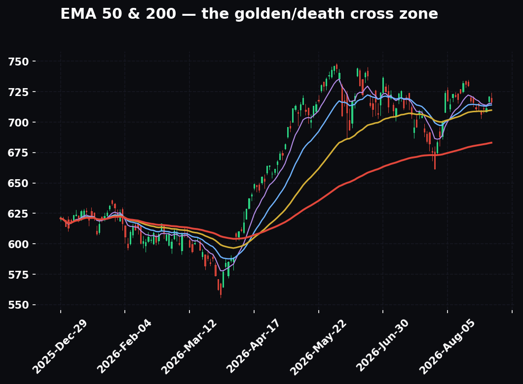
The regime reflex: the same setup is a full-size long in green, a half-size quick-target trade in yellow, and a no-trade or a short in red. The chart doesn't decide — the weather does.
The value-chain reflex: whenever you find a theme, ask "who else does this pay?" Compute → memory → networking → foundry → equipment → EDA → buildings/land → power/electrical → cooling → generation/nuclear → construction. One theme, dozens of names, winners and losers at every layer. Build the chain with the five questions: headline product, what goes into it, what machines make it, what it needs to run, who builds all that.
The connect-the-dots reflex: when a chain's bellwether reports, don't just trade the bellwether. Read the guidance, not the headline, ask what its numbers mechanically imply for the layer above and below it, and rotate to whatever hasn't moved yet.
The independence reflex: three confluences only count if they measure three different things. Flow, level, and participation are three votes. Three momentum indicators are one vote wearing three hats.
The Bottom Line
Most traders lose because they mistake a picture for the whole story. They fall in love with a pattern on one chart and never ask what the sector is doing, where the money is rotating, what the Fed just signaled, or when the company reports. They're reading the passenger's face and ignoring the train.
The method that beats a pretty chart is not more indicators. It's altitude. Start at 30,000 feet with macro, drop to the sector, then to the stock, and let the chart be the last, smallest input — the thing that gives you a number, not a reason. Run the same discipline inside the chart, letting the higher timeframe set direction and the lower one set the trigger. Size the trade to the weather. Stack independent confluences, not costumed copies of one idea. And once you're inside a theme, refuse to stop at the obvious name — walk the chain, because the AI story isn't one stock; it's forty, across a dozen layers, most of them un-crowded and hiding in plain sight.
There are thousands of relatively straightforward trades sitting out there right now for anyone willing to think in systems instead of single charts. The pretty chart will always be there. The question is whether you know what's holding it up.
Bound by rules, feared by trade.