
You can run flawless technicals. Clean EMA stack, textbook golden pocket, confluence across five timeframes. And then at 8:30am on a Tuesday, one line of government data crosses the wire and your setup is vaporized before you can blink. Price gaps clean through your stop, the "support" you trusted was never real, and you're left staring at a red candle wondering what you missed.
You missed the calendar.
Charts tell you where price is and how it's behaving. The economic calendar tells you when the ground is about to move under it. Master traders don't just read charts — they read the schedule of scheduled violence. Every month there's a rhythm of data releases that inject fresh information into the market all at once, and in the seconds around those releases, price stops being a technical instrument and becomes a referendum on the economy. If you don't know what's coming and what it means, you're not trading. You're standing in traffic with your eyes closed.
This is the guide that fixes that. By the end you'll know every major release, what it measures, why the market cares, the exact mechanic that turns a number into a move, how the same number produces opposite reactions in different market regimes, how the calendar layers onto your technicals across multiple timeframes, and — most important — how to trade around event risk instead of getting run over by it.
The Concept: Markets Price the Future, Data Corrects the Guess
Here's the single idea that makes the entire economic calendar make sense: the market is a forecasting machine, and economic data is the report card.
At any moment, the price of everything — stocks, bonds, the dollar, gold, Bitcoin — already reflects the crowd's best collective guess about the future. Where inflation is heading. Whether the Fed will cut rates. How strong the job market is. All of that expectation is baked in to the current price. It's already there.
So when a data release lands, the market doesn't react to the number itself. It reacts to the gap between the number and what was already expected. This is the concept beginners get wrong constantly: good news can crush a stock, and bad news can rip it higher. Not because the market is irrational, but because "good" and "bad" were already priced. What moves price is surprise — the distance between reality and the guess.
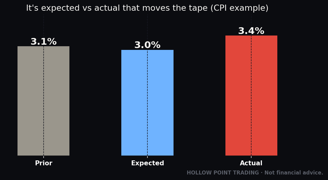
That's why the whole game runs on three numbers, and you'll see them on every calendar entry:
- Prior — what the last reading was. Your baseline. The trend.
- Forecast (Expected/Consensus) — what economists collectively predict. This is what's priced in.
- Actual — the real number when it drops.
The move comes from Actual vs. Forecast, with Prior giving context for the trend. We'll drill into that mechanic in a minute — it's the beating heart of event trading. But hold the frame first: you are never trading the economy. You are trading the difference between the economy and the story the market already told itself about the economy.
Why "priced in" is a real, physical thing
"Priced in" isn't a metaphor — it's the accumulated weight of every position taken in advance. In the week before a CPI print, traders and institutions who expect +0.3% inflation buy and sell to reflect that view. By the time the number lands, the aggregate book of the entire market is already tilted for +0.3%. If reality confirms it, there's nothing left to do — the trades are already on. If reality contradicts it, thousands of positions are suddenly wrong and have to be unwound at once. That forced unwind — not the number — is the move you see on the screen.
This is why the biggest reactions come not from "bad" data but from unexpected data. A market braced for disaster that gets merely-bad news often rallies, because the disaster that was priced didn't materialize. Understanding this one mechanic will save you from the single most common beginner error: reading the number as good or bad in a vacuum.
The consensus is a distribution, not a point
The "Forecast" you see is a median of dozens of economists. But those economists don't all agree — they're spread across a range. When that range is tight (everyone clustered at +0.3%), a miss is a genuine shock and the reaction is violent. When the range is wide (guesses from +0.1% to +0.6%), the market is already uncertain, some of the surprise is pre-absorbed, and the reaction is muffled. Advanced calendars show you the range or the "whisper number" (the unofficial number traders actually expect, which can differ from the published consensus). When the whisper and the consensus diverge, the published "surprise" can lie to you — the market reacts to the whisper.
The Mechanism: Expected vs. Actual vs. Prior
Let's make this concrete, because this is the part you'll use every single week.
Imagine CPI (inflation) is due. The forecast is +0.3% month-over-month. The market has spent the last week positioning for exactly that. Traders have bought and sold in advance so that a +0.3% print would be a non-event — it's already in the price.
Now three things can happen:
Actual comes in at +0.3% (in line). The surprise is zero. Price often does very little on the number itself — or it snaps back and forth chasing liquidity, then resolves toward whatever the pre-existing trend was. "Buy the rumor, sell the news" lives here. The event is behind us; positioning that was waiting for it now unwinds.
Actual comes in at +0.5% (hot / above forecast). Inflation is running hotter than anyone expected. That's a hawkish surprise — it means the Fed is more likely to keep rates high or hike. Bonds sell off, yields jump, the dollar strengthens, and rate-sensitive stocks (tech, growth) usually get hit. The move is proportional to the size of the miss and how much it changes the Fed story.
Actual comes in at +0.1% (cool / below forecast). Inflation is falling faster than hoped. That's dovish — rate cuts get more likely. Stocks rip, bonds rally, yields fall, dollar softens.
The magnitude of the reaction depends on three multipliers you should learn to eyeball:
- Size of the surprise. A tiny miss barely registers. A big miss detonates.
- What the market cares about right now (the "market regime"). In an inflation-obsessed year, CPI is the whole ballgame and jobs data barely matters. In a growth-scare year, it flips — jobs and ISM dominate, inflation gets shrugged off. The same data point has different power on different days depending on the current fear. This is the nuance that separates real traders from calendar-readers.
- Positioning and liquidity. If everyone's already leaning one way, an in-line number can still trigger a violent unwind. Thin liquidity (holidays, early closes, pre-release freezes) amplifies everything.
There's also a fourth wrinkle that traps beginners: the revision. Many releases quietly revise the prior month's number when the new one drops. A "good" jobs number can be poison if last month got revised down by 100,000 — the trend just got worse even though today's headline looks fine. Always read the revision.
And one more: the knee-jerk vs. the real move. The first spike in the first few seconds is often algorithmic and frequently wrong — it fades. The "real" move sometimes comes 15–30 minutes later once humans digest the internals (the sub-components under the headline number). Patience beats reflexes at the release.
Putting a number on the surprise: the standard-deviation frame
Pros don't just note "it beat" — they measure by how much relative to normal noise. A CPI that comes in 0.1% above forecast when the typical monthly wobble is 0.1% is a one-sigma event: mild. A 0.3% miss when the noise is 0.1% is a three-sigma event: a genuine bomb. You don't need statistics software to internalize this. Just ask: is this miss inside the range of what usually happens, or outside it? Reactions scale non-linearly — a miss that's twice as big often produces a move that's three or four times as large, because it doesn't just move the number, it changes the narrative and forces a repricing of everything downstream (the Fed path, the terminal rate, the recession odds).
The reaction has a shape, not just a direction
A release reaction typically runs through four phases, and knowing them keeps you from getting chopped up:
- The spike (0–5 seconds). Algorithms parse the headline and fire. Violent, thin, often overshoots. This is the worst possible moment to enter — spreads are wide and you're trading against machines reading the wire faster than you can blink.
- The fade or extension (5 seconds–5 minutes). The overshoot corrects, or it doesn't. If the move holds and extends, the surprise was real and broad. If it snaps back, the headline was misleading and the internals disagreed.
- The digestion (5–30 minutes). Humans read the sub-components, the revisions, the composition. This is where the real move is often born — sometimes in the opposite direction of the spike.
- The trend day (30 minutes–close). Once the market agrees on what the number means for the Fed, price picks a direction and often runs with it all session. This is the phase you actually want to trade — defined risk, macro wind at your back, chart rules working again.
Beginners fight phase 1 and 2. Pros wait for phase 3 to reveal the truth and trade phase 4.
The Releases: What Each One Measures and Why It Moves Markets
Now the roster. For each, learn three things: what it measures, why the market cares, and its "tell."
CPI — Consumer Price Index (Inflation)
What it measures: The change in prices for a basket of consumer goods and services — the cost of living. Reported month-over-month (MoM) and year-over-year (YoY). Released monthly by the Bureau of Labor Statistics, usually around the 10th–15th at 8:30am ET.
The nuance: Watch Core CPI — the number that strips out food and energy. Why? Because food and gas prices are wildly volatile and don't reflect the underlying inflation trend. The Fed and the market care most about Core, because it's stickier and harder to fix.
Go one level deeper — the composition. Core CPI itself splits into two blocks the pros watch separately: core goods and core services. Core services is where the stickiness lives, and within it, shelter (housing/rent) is the giant — roughly a third of the whole index. Shelter is lagging by construction (it reflects rents signed months ago), so the Fed mentally discounts it. That's why a "hot" CPI driven entirely by shelter often fades: the market knows shelter is old news. Meanwhile the newer, faster category traders obsess over is "supercore" — core services excluding shelter — because it best reflects the current-month wage-and-demand pressure the Fed can actually influence. When supercore surprises, the reaction is real and durable.
Why the market cares: Inflation is the Fed's primary enemy. Hot CPI = Fed stays hawkish (rates high) = bad for stocks and bonds. Cool CPI = Fed can ease = risk-on. In an inflationary regime, CPI is the single most explosive scheduled event on the calendar, routinely worth 1–3% index moves in minutes.
Worked walk-through. CPI YoY forecast 3.1%, Core forecast 0.3% MoM. Actual headline 3.1% (in line) but Core prints 0.4% MoM with supercore accelerating. The headline looks like a non-event — a beginner shrugs. But the composition is hawkish: sticky services inflation just re-accelerated. Yields grind up over the next hour, the two-year Treasury leads, and tech leaks lower all afternoon even though the headline "matched." The headline matched; the trade was in the mix.
PCE — Personal Consumption Expenditures (The Fed's Favorite Inflation Gauge)
What it measures: Another inflation reading, but the one the Federal Reserve actually targets for its 2% goal. Released by the Bureau of Economic Analysis, later in the month than CPI.
Why two inflation numbers? PCE uses a broader basket and adjusts for how consumers substitute (when beef gets expensive, people buy chicken — PCE captures that, CPI is slower to). It also weights healthcare differently and counts costs paid on your behalf (like employer insurance), so it's structurally broader. PCE usually runs a touch cooler than CPI. Core PCE is the number Fed officials quote when they talk about hitting target.
Why the market cares: It's the Fed's scorecard. But here's the trader's edge: PCE comes after CPI, and its components (PPI, import prices, and the CPI/PPI categories that feed PCE) are already known. So PCE is often less of a surprise — the market has usually done the math. CPI is the fireworks; PCE is the confirmation. Respect it, but don't expect CPI-level chaos unless it diverges from what the inputs implied.
The edge case that pays. Twice or three times a year, PCE diverges from what CPI and PPI implied — a category the Fed weights differently swings the number. Because everyone assumed PCE was "already known," positioning is light and the surprise hits an unprepared market. Those are the PCE days that move like a CPI day. Watch the PPI print two days earlier: if PPI's healthcare and portfolio-management categories (which feed PCE but aren't in CPI) surprised, PCE can surprise even when CPI didn't.
PPI — Producer Price Index (The Upstream Signal)
What it measures: Inflation at the wholesale/producer level — what businesses pay before it reaches you. Released a day or two before or after CPI, 8:30am ET.
Why it matters more than beginners think: PPI is upstream of CPI and, critically, several of its categories feed directly into the PCE calculation. Sophisticated traders use PPI plus CPI to build their own PCE estimate before PCE is released — turning the Fed's favorite gauge into a largely predictable event. PPI itself moves markets modestly, but its real value is as a leading tell for the two bigger inflation prints around it.
NFP — Non-Farm Payrolls (The Jobs Report)
What it measures: How many jobs the U.S. economy added or lost last month (excluding farm workers, hence "non-farm"). Released the first Friday of every month at 8:30am ET by the BLS. It comes packaged with the Unemployment Rate and Average Hourly Earnings (wage inflation).
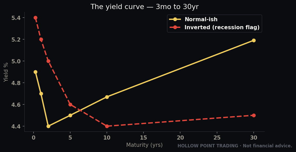
Why it's a monster: This is the most-watched single data point in global markets. It's a broad, timely read on the entire economy's health. Strong jobs = strong economy, but in an inflation regime it can also mean "the Fed has to stay tight." Weak jobs = slowdown fears, but can mean "cuts are coming." The interpretation flips with the regime, which is exactly why it's so volatile — the market has to decide in real time which story wins.
Read the internals:
- Headline payrolls — the jobs number itself.
- Unemployment rate — can tell a different story than payrolls. It comes from a different survey (the household survey) than the headline (the establishment survey), so the two can disagree in the same report. When they diverge, the market picks whichever tells the scarier story for the current regime.
- Average Hourly Earnings — wage growth. Hot wages = inflation pressure = hawkish. This sub-line has moved markets harder than the headline on plenty of occasions.
- Labor Force Participation — the unemployment rate can fall for a good reason (jobs) or a bad one (people quitting the search). Participation tells you which.
- Revisions — prior two months get revised. A big downward revision can turn a "beat" into a bear day.
The two-survey trap, worked. Headline payrolls print +250k (a beat vs +180k forecast). Kneejerk: stocks pop, economy strong. But the unemployment rate rose from 4.1% to 4.3% because the household survey showed job losses, and prior months were revised down 90k combined. Within twenty minutes the narrative flips from "strong" to "cracking beneath the surface," and in a growth-scare regime stocks reverse hard. The headline beat; the report was ugly.
JOLTS & ADP — The Jobs Report's Warm-Up Acts
JOLTS (Job Openings and Labor Turnover Survey) measures open positions and the "quits rate" (how confident workers are — quitters believe they can find better jobs). It's older data but the quits rate is a clean read on labor-market tightness. ADP is a private payrolls estimate released two days before NFP; it's a poor predictor of NFP specifically but moves markets anyway because it's the first jobs read of the week. Treat ADP as a sentiment-setter for NFP positioning, not as a forecast — traders who trade ADP as if it predicts Friday get burned regularly.
FOMC — The Federal Reserve Meeting & the Dot Plot
What it is: The Federal Open Market Committee meets eight times a year to set the federal funds rate — the interest rate that anchors the entire cost of money. The decision drops at 2:00pm ET, followed by the Chair's press conference at 2:30pm. This is the single most important recurring event in all of finance.
The three parts, in order of what actually moves price:
- The rate decision — usually the least surprising part, because the market prices Fed moves weeks ahead via Fed funds futures. When it is a surprise, it's an earthquake.
- The statement — the exact wording matters. Traders parse single words. Removing "patient" or adding "some further" can move billions. Traders literally run a word-for-word diff of this statement against the last one.
- The Summary of Economic Projections and the dot plot (quarterly, at four of the eight meetings) — a chart where each Fed official anonymously plots where they think rates should be over the next few years. It's the Fed's forecast of itself. If the dots shift up, the Fed is signaling higher-for-longer — hawkish. Dots shift down — dovish. The dot plot regularly overrides the actual rate decision as the market-mover. Watch the median dot and the spread of the dots (agreement vs. division on the committee).
- The press conference — the Chair can undo everything. A "hawkish cut" (cutting rates but sounding cautious) or a "dovish hold" (holding but signaling cuts) happens at the podium. The 2:30–3:00 window is often more violent than the 2:00 decision.
Why the market cares: Interest rates are the price of money — they discount every future cash flow in every asset on earth. The Fed doesn't just react to the economy; it steers it. FOMC day is the one day a month you should assume anything can happen.
The signature FOMC-day whipsaw. A brutal, recurring pattern: the 2:00pm statement reads hawkish, stocks dump. Then at 2:40pm the Chair strikes a softer tone in the Q&A, and stocks rip back through the highs. Traders who shorted the 2:00 drop get stopped on the 2:40 rip; traders who chased the 2:40 rip sometimes give it all back into the close if a single hawkish clarification lands at 2:55. FOMC afternoons routinely trade both directions with wicks that eat stops on both sides. This is why the veteran move is to trade the next day — let the whipsaw resolve, read the closing print as the market's verdict, and trade the follow-through Thursday.
GDP — Gross Domestic Product
What it measures: The total value of everything the economy produced — the broadest measure of growth. Reported quarterly, in three passes: Advance (first, most market-moving), Second, and Third (revisions). Annualized rate.
Why the market cares — with a catch: GDP is the definitive scorecard of economic health, but it's backward-looking and slow. By the time Q2 GDP drops, we're deep into Q3 and the market has already sniffed out the trend from faster data (jobs, ISM, retail). So GDP is high-importance but often low-surprise. It moves markets most when it diverges sharply from expectations or when it confirms/denies a recession narrative. Watch the inflation component within GDP (the GDP deflator / PCE prices) — sometimes the growth number is fine but the price data inside it steals the show.
The composition tell. GDP splits into consumption, investment, government, and net exports. A "strong" GDP built on inventory restocking or a one-off surge in government spending is weaker than it looks — those don't repeat. A strong GDP built on final sales to private domestic purchasers (the cleanest core-demand measure) is the real thing. Pros read what drove the number before deciding whether the strength is durable.
Retail Sales — The Consumer Pulse
What it measures: Total receipts at retail stores — how much Americans are actually spending. Monthly, 8:30am ET, from the Census Bureau. The U.S. economy is roughly 70% consumer spending, so this is a direct read on the engine.
The nuance: Watch the "Control Group" — retail sales excluding autos, gas, and building materials. It strips out the volatile stuff and feeds directly into GDP calculations. A strong headline with a weak control group is a warning; a weak headline with a strong control group is a green light. Beginners read the headline; traders read the control group.
The gas-price illusion. Because the headline includes gas stations, a month where gas prices fell can drag the headline down even as real discretionary spending rose. The reverse also traps people: a headline "beat" driven entirely by higher gas prices isn't strength — it's consumers spending more to get the same tank. Always back gas out. The control group does that for you.
Why the market cares: Strong consumer = resilient economy = the Fed can stay tight; also good for consumer-discretionary stocks. Weak retail sales = the consumer is tapping out = slowdown signal.
ISM / PMI — The Business Survey (The Early Warning)
What it measures: Surveys of purchasing managers at businesses — are they seeing more orders or fewer, hiring or firing, paying more for inputs or less. Two main flavors: ISM Manufacturing and ISM Services (services is bigger — the U.S. is a services economy). S&P Global also publishes competing PMI readings.
The magic number: 50. Above 50 = expansion. Below 50 = contraction. It's a diffusion index, so 50 is the exact line between growth and shrinkage. A print going from 51 to 49 isn't a small move — it's the economy crossing from growing to shrinking. The market treats crossing 50 as a psychological threshold worth more than the raw point-change would suggest.
Why the market cares: PMIs are forward-looking and fast — purchasing managers see demand changing before it shows up in GDP or jobs. They're one of the best early-warning systems on the calendar. Watch the "Prices Paid" sub-index for an early inflation signal, "New Orders" for future demand, and "Employment" as an early tell on the jobs report. ISM Services below 50 in an expansion has repeatedly been the first crack in a soft-landing narrative.
The New-Orders-minus-Inventories tell. A quiet pro trick: when new orders are rising while inventories are falling, businesses will have to ramp production soon — bullish for the coming quarters. When inventories are piling up as new orders fade, a slowdown is coming. This sub-component spread often leads the headline PMI itself by a month or two.
Jobless Claims — The Weekly Heartbeat
What it measures: How many people filed for unemployment benefits last week. Initial Claims (new filers) and Continuing Claims (still collecting). Released every Thursday at 8:30am ET — the only major weekly data point.
Why the market cares: Because it's weekly, it's the highest-frequency read on the labor market — a real-time pulse between the monthly jobs reports. Rising initial claims = fresh layoffs starting. Rising continuing claims = people who lost jobs can't find new ones (the labor market is tightening from the exit). The two tell different stories: initial claims can stay low while continuing claims creep up — meaning few new layoffs but a freeze on hiring. That combination has repeatedly preceded labor-market turns. Because any single week is noisy (holidays, seasonal quirks, one big auto-plant shutdown), watch the 4-week moving average to see the real trend.
In a "bad news is good news" regime (where weakness means Fed cuts), a bad claims number can lift stocks. In a growth-scare regime, it sinks them. Same number, opposite reaction — regime is everything.
Consumer Sentiment / Confidence — The Vibe Check
What it measures: How optimistic households feel about the economy and their finances. Two big ones: the University of Michigan Consumer Sentiment survey (with a preliminary and final read each month) and the Conference Board Consumer Confidence index. Michigan also publishes inflation expectations — how much inflation consumers expect, which the Fed watches closely because expectations can become self-fulfilling.
Why the two differ: Michigan's survey is weighted more toward how people feel about their personal finances and buying conditions; the Conference Board leans more toward the labor market (its "jobs plentiful vs. jobs hard to get" spread is a genuinely useful labor tell that sometimes front-runs NFP). They can move in opposite directions in the same month — read which one the current narrative cares about.
Why the market cares: Sentiment leads spending — scared consumers stop buying. It's softer, more "second-tier" data, so it moves markets less than CPI or NFP. But it can surprise, and the inflation-expectations sub-reading occasionally punches above its weight when the Fed is in inflation-fighting mode — a jump in the 1-year or 5-year expectations line has moved the whole bond market on an otherwise-quiet Friday. Don't build a trade around it; do respect it as a tiebreaker.
Jackson Hole & Fed-Speak: The Unscheduled Bombs
Here's what most calendars won't flag loudly enough: Fed officials talk constantly, and their words move markets as hard as data.
Between meetings, Fed governors and regional presidents give speeches, sit for interviews, and appear on panels. Each one is a chance to nudge the market's rate expectations. Traders track these under "Fed-speak," and a hawkish or dovish comment from a voting member can trigger a real move — especially in the "blackout period" (the ~10 days before an FOMC meeting when officials go silent, so any pre-blackout comment carries extra weight as the last signal).
Not all Fed voices are equal. There's a hierarchy. The Chair is the only voice the whole market obeys unconditionally. The Vice Chair and the New York Fed President are permanent voters and near-Chair in weight. Then the rotating regional voters for that year. Then the non-voters, whose speeches move price least — but who are sometimes used as trial balloons to float an idea before the Chair commits. Know who's a voter this year; a hawkish line from a non-voting perennial hawk is close to noise, while the same line from the Chair is a policy signal.
The Super Bowl of Fed-speak is the Jackson Hole Economic Symposium — an annual late-August gathering in Wyoming where the Fed Chair typically delivers a marquee policy speech. Historically, Chairs have used Jackson Hole to signal major policy pivots — the venue where the tone for the next 6–12 months gets set. It is not on the "8:30am data" grid, but it belongs circled on your calendar in red. The August lull can be dead quiet right up until that Friday-morning speech detonates it.
How to treat Fed-speak: Know when the Chair and key voters are scheduled to speak (calendars list these). Assume any speech during a sensitive window can move price. And never fight a fresh, clear signal from the Chair — that's the one voice the whole market obeys.
The Treasury refunding, auctions, and the plumbing
One more layer most retail traders never see: the Treasury's quarterly refunding announcement (how much debt it plans to issue and at what maturities) and the regular bond auctions. When supply surprises — more long-dated issuance than expected — yields can jump on the announcement alone, dragging rate-sensitive stocks with them, with no "economic data" involved at all. A weak auction (poor demand, high yield-tail) can spike yields intraday. You don't need to trade these, but when stocks are selling off and there's no obvious catalyst on the data calendar, check whether a big auction just went badly. The bond market's plumbing moves equities more often than equity traders realize.
How the Data Interacts: Reading the Whole Week, Not One Print
Individual releases are letters; the week is the sentence. Pros read the sequence.
A classic bullish-for-stocks week in a Fed-easing regime: cool PPI Tuesday → cool CPI Wednesday → soft retail sales Thursday → each print reinforces the "inflation's beat, cuts are coming" story, and stocks build a trend all week rather than spiking and fading. The prints compound. Conversely, a week where hot CPI is followed by a hawkish Fed speaker and then hot PCE is a triple confirmation of "higher for longer," and shorting the rallies works all week.
The danger week is the conflicting week: hot CPI (hawkish) but weak retail sales (dovish for the Fed but bearish for growth). Now the market is genuinely confused, ranges are wide, and no clean directional read exists. Recognizing a conflicting week early is worth money — it tells you to size down and scalp rather than swing.
Different Regimes, Different Rules
The single most important advanced concept in this whole guide: the same number produces the opposite reaction depending on what the market is afraid of. Learn the three main regimes.
The inflation regime
The market fears inflation and a Fed that won't cut. Here, CPI and PCE are the whole ballgame, wages inside NFP matter more than the headline, and "good news is bad news" — strong growth data sells off stocks because it means the Fed stays tight. In this regime you trade the inflation prints as your Tier-1 grenades and treat growth data (GDP, retail) as secondary. A hot CPI is a clean short-tech setup; a cool CPI is a clean long. The bond market leads and equities follow yields tick for tick.
The growth-scare / recession regime
Now the market fears a slowdown, not inflation. The polarity flips: weak jobs and sub-50 ISM become the grenades, and inflation data gets shrugged off ("who cares about CPI if we're heading into recession"). Here "bad news is bad news" — weak data sinks stocks because earnings, not the Fed, are the fear. Claims, ISM, and the unemployment rate become Tier-1. A cool CPI that would've ripped stocks in the inflation regime does nothing here, because inflation isn't the fear.
The soft-landing / Goldilocks regime
The dream scenario: growth holding up, inflation falling. Here the market wants data that's neither too hot nor too cold. A too-strong jobs number is bad (Fed stays tight); a too-weak one is also bad (recession). The market rewards the middle. This is the hardest regime to trade because the reaction function is non-linear — you have to know both thresholds. "Good but not too good" is the trade.
The regime can change on a single print. The dangerous moments are the transitions — the week the market stops caring about inflation and starts caring about growth. Often one shocking release (a jobs number that cracks) flips the whole reaction function overnight. If you're still trading the old regime's rules the morning after the flip, you'll be perfectly wrong. Ask yourself weekly: what is the market afraid of this week? When the answer changes, your playbook changes with it.
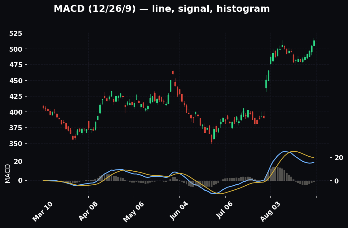
Volatility Regimes: Calm vs. High-Vol Tape
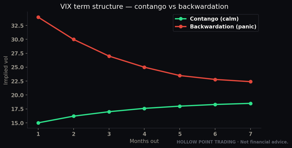
Separate from what the market fears is how much it's moving. In a low-volatility, calm tape, releases produce clean, tradeable one-directional moves — the market is confident, the surprise resolves quickly, and the trend day sets up nicely. In a high-volatility tape (VIX elevated, everyone on edge), the same size surprise produces wilder whipsaws, deeper fades, and more stop-runs in both directions before resolving. The knee-jerk is bigger and less reliable; the fade is more violent.
Practical adjustment: in high-vol tape, widen your stops and cut your size around events, and wait longer for the dust to settle — the "15–30 minutes later" real move might be "45–60 minutes later." In calm tape you can act sooner and size closer to normal. Reading the volatility regime off the VIX and the overnight range before an event is as important as reading the consensus.
Multi-Timeframe Treatment: Where the Calendar Lives on Each Chart
A data release hits every timeframe at once, but it means something different on each.
On the 1m–5m (the release itself): This is the whipsaw zone. Support and resistance are suspended. The candles are enormous, the wicks eat stops, and technical levels are noise. Do not trade the 1m into and through a Tier-1 release. The only job of the low timeframes here is to show you where the fade exhausts and where the post-event trend begins.
On the 15m–1H (the session): This is where the real post-event trend lives. Once the knee-jerk fades, the 15m and 1H reveal the direction the market actually chose. This is your primary trading timeframe for the aftermath — a clean 15m higher-low that forms 30 minutes after a cool CPI, with the macro wind at your back, is the setup.
On the 4H–Daily (the trend): Here the release is a single catalyst candle that either confirms or breaks the standing trend. A daily close back above the 55 EMA on a cool-CPI gap is trend confirmation you can hold for days. A daily gap through the 55 EMA on a hot print is trend invalidation — respect it regardless of how bullish you were.
On the Weekly (the regime): Zoom all the way out and the individual prints blur into the macro trend — the weekly chart is the regime made visible. When the weekly is trending up and the data flow keeps confirming (cool inflation, soft-landing growth), you're swimming downstream. When the weekly rolls over as the data flips, the regime is changing under you.
The discipline: let the low timeframes show you the exhaustion, trade the setup on the middle timeframes, and hold in the direction the high timeframes bless. Never let a 1m spike talk you out of a daily trend, and never let a daily bias make you trade into a 1m release-whipsaw.
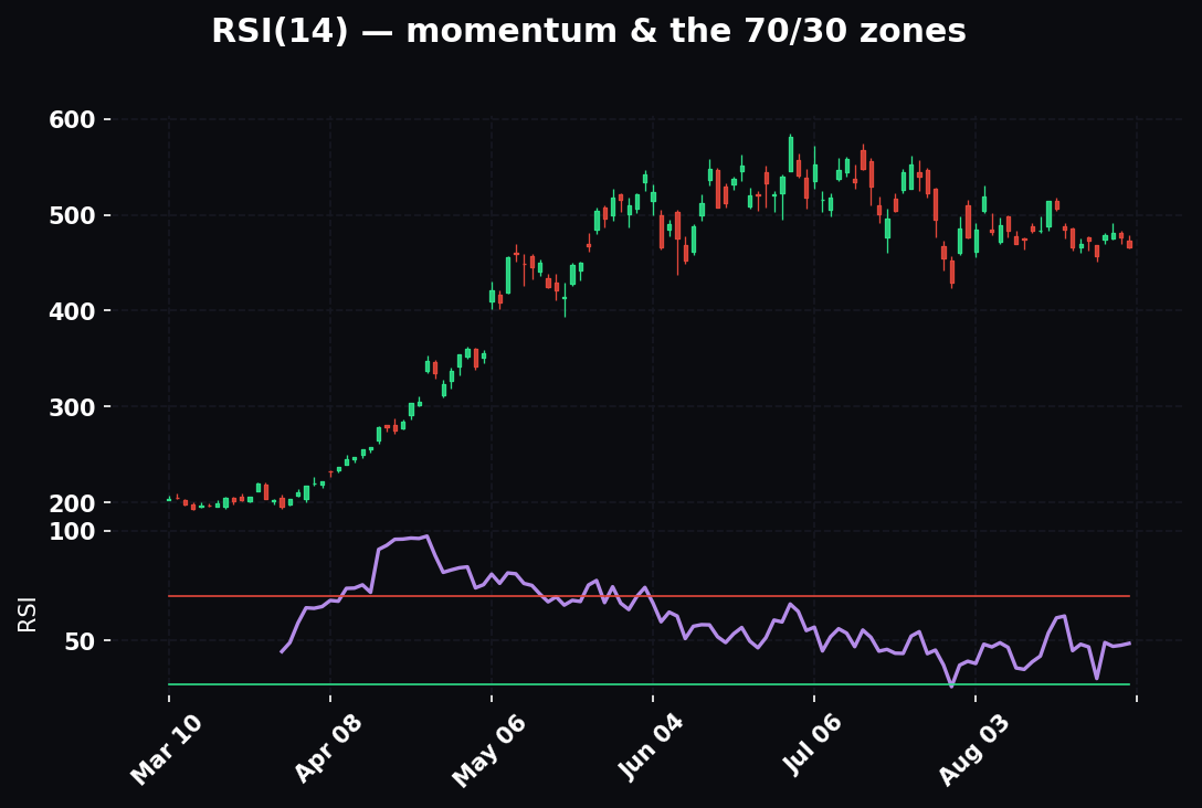
Confluence: Combining the Calendar With Your Other Tools
The calendar is one layer. It gets powerful when it stacks with your technicals. Three combinations to master.
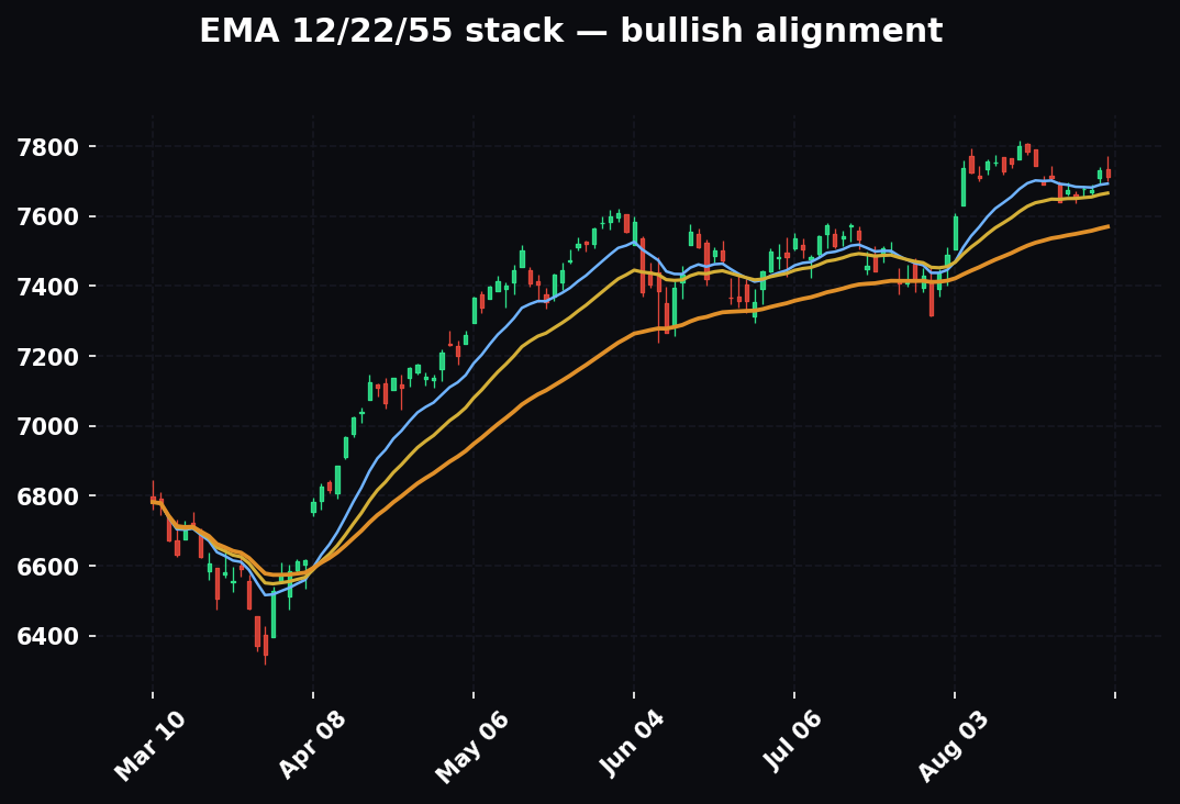
Calendar + EMA 12/22/55 trend
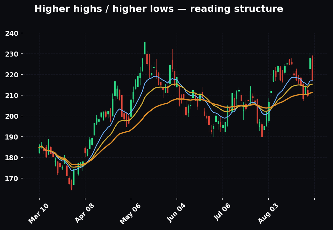
Our trend read runs on EMA 12/22/55 with timeframe-weighted confluence. A major data release is precisely the kind of catalyst that either confirms a trend (price gaps in the direction of the EMA stack and holds — high-conviction continuation) or invalidates it (price rips through the 55 EMA on a data-driven gap — the trend is broken, respect it). The highest-conviction setup on the board is a data print that pushes price in the direction the EMA stack was already pointing: the macro catalyst and the technical trend agree, and those are the days trends run without pulling back. The lowest-conviction, highest-danger setup is a data print that shoves price against an established EMA stack — either the trend is breaking or the move is a fade, and you don't yet know which. Stand aside until the 55 EMA reclaims or rejects.
Calendar + support/resistance and the golden pocket
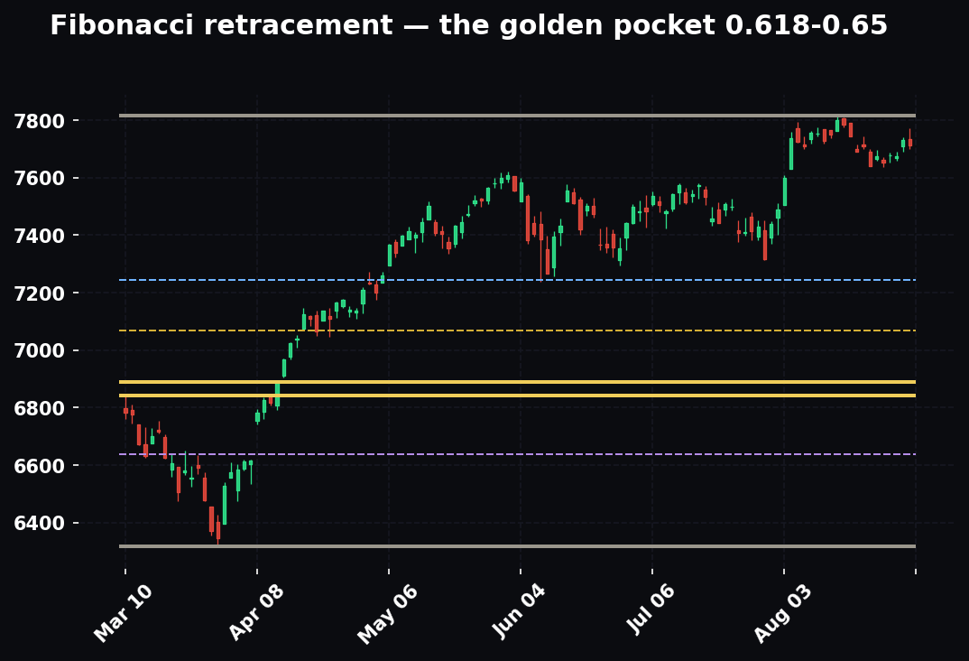
Data creates the energy; your levels give it a target. A cool CPI that gaps price up into a known resistance shelf or a daily 0.618–0.65 golden pocket is a gift: the catalyst supplies the fuel, the level supplies the exit or the short trigger. The reverse — a hot print that dumps price into major support or a golden pocket from above — is where you look for the reversal-continuation. The event tells you when price will reach the level with force; the level tells you what to do when it gets there. Neither alone is the trade; together they're a plan.
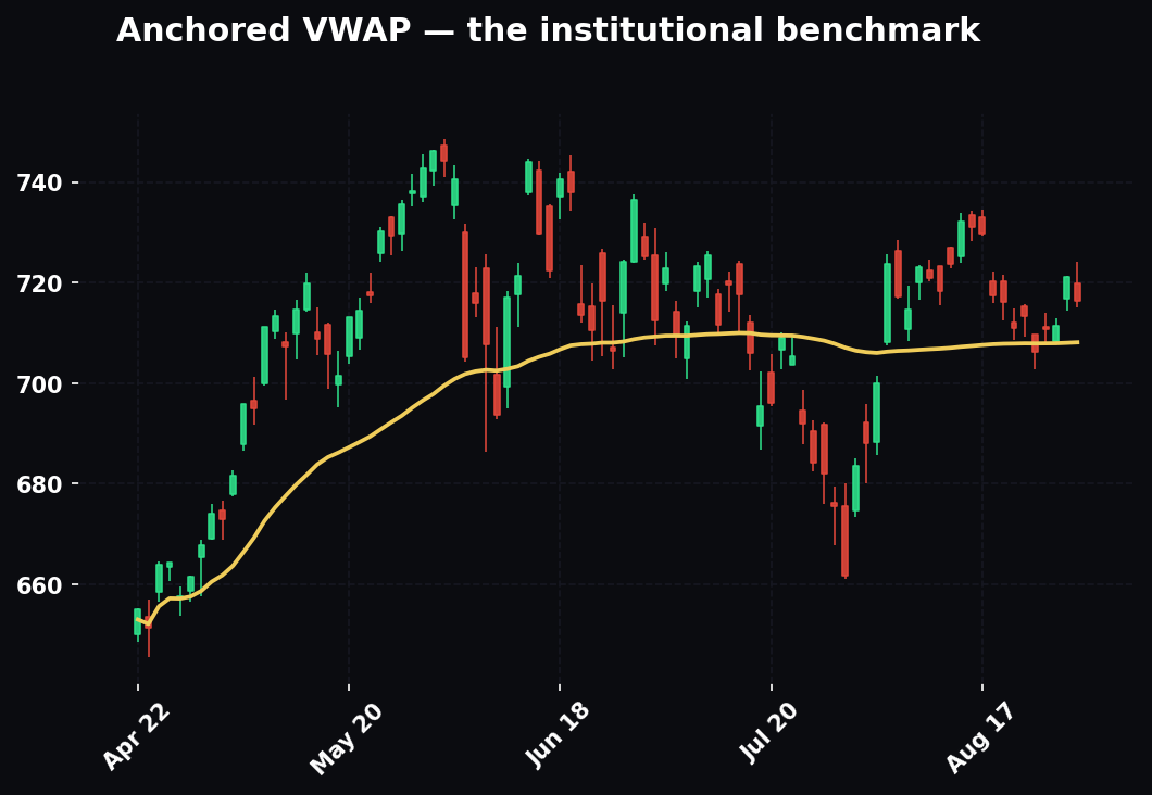
Calendar + volume and VWAP
The post-release session VWAP is the single best "who's winning" line on an event day. After the knee-jerk, if price reclaims and holds above VWAP on rising volume, buyers won the print — trade long continuations off VWAP retests. If price rejects VWAP and holds below on volume, sellers won. And the volume signature confirms the surprise's realness: a genuine surprise comes with a massive volume spike that sustains; a fake-out spike comes on a volume burst that immediately dries up. When the anchored VWAP from the release, the EMA stack, and the volume all agree, that's a full-confluence event trade — macro catalyst, technical trend, and order-flow all pointing the same way.
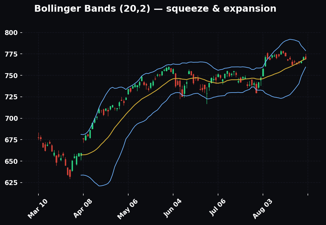
How to Read/Use It: Worked Examples
Theory is nice. Here's how it looks in the seat.
Example 1 — The hot CPI fade. CPI forecast +0.3%, actual +0.5%. Hot. First reaction: NASDAQ futures dump 1.2% in 90 seconds, yields spike, dollar rips. The beginner shorts the low tick. The trader waits. Fifteen minutes in, the internals show the beat was driven almost entirely by shelter, a lagging component the Fed already discounts. The knee-jerk fades, price grinds back to unchanged by 10am. Lesson: the headline triggers the algos; the components decide the real move. Don't marry the first candle.
Example 2 — The "good news is bad news" jobs report. NFP forecast +150k, actual +310k with hot wages. Great economy, right? Stocks fall. Why? Because in this regime the market feared the Fed would stay higher-for-longer, and a blowout jobs print killed the rate-cut hope that was priced in. Lesson: a number is only "good" relative to what the market wanted. Ask what story is priced before you decide which way the surprise cuts.
Example 3 — The dovish hold. FOMC holds rates steady — exactly as expected, zero surprise. Price barely flinches at 2:00pm. Then at 2:35pm the Chair says the committee sees "meaningful progress" on inflation. That single phrase reprices the rate path. Stocks rip 1.5% into the close. Lesson: on FOMC day the decision is the appetizer; the press conference is the meal.
Example 4 — The in-line non-event that still paid. Retail sales lands exactly on forecast. No surprise. But the control group smashed higher while the headline was dragged down by falling gas prices. Consumer-discretionary stocks quietly outperform all day while the index does nothing. Lesson: the headline is for the newspaper; the sub-components are for the trade.
Example 5 — The regime flip in a single print. For months the market traded the inflation regime: every cool CPI ripped stocks, every hot one dumped them. Then an NFP prints +40k against +160k forecast, with the unemployment rate jumping two-tenths and prior months revised down. Stocks fall hard on what would, a week earlier, have been "great, the Fed can cut" news. The fear just switched from inflation to recession. Traders still short-tech-on-hot-CPI got run over the following week because the reaction function inverted. Lesson: the regime is a variable, not a constant. When one print reprices what the market fears, throw out last month's playbook.
Example 6 — The full-confluence aftermath trade. Cool CPI gaps NQ up through the 1H 55 EMA it had been trapped below for two sessions. The knee-jerk spike fades to a higher low at 9:15, which forms right on the reclaimed 55 EMA and above the session VWAP, on sustained volume. Macro wind (cool inflation, dovish), technical trend (55 EMA reclaimed), and order flow (above VWAP, volume holding) all agree. Long off the higher low, stop below VWAP, target the next resistance shelf a clean 1:3 away. Lesson: you don't trade the print — you trade the high-confluence setup the print creates.
How It Fits the Top-Down Process
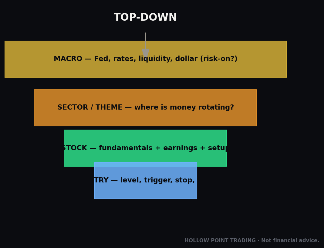
At Hollow Point we trade top-down: macro → sector → stock. The economic calendar is the macro layer — the tide that lifts or sinks every boat. Here's how it slots into the framework.
Macro (the calendar): Before anything else, know what's on the schedule this week and what regime we're in. Is the market trading inflation, growth, or Fed policy right now? That tells you which releases are live grenades and which are duds. CPI in an inflation year is a 3% event; in a growth-scare year it might be a shrug. The calendar sets the weather.
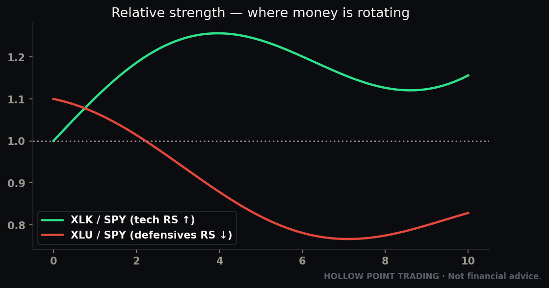
Sector: The data tells you which sectors are in favor. Hot inflation and rising yields? Financials up (banks earn more on higher rates), long-duration tech down (future cash flows discounted harder). Slowing growth? Defensives (utilities, staples, healthcare) over cyclicals (industrials, discretionary, semis). Strong retail sales? Consumer discretionary leads. The macro print rotates money between sectors before it picks stocks — and the rotation is often more tradeable than the index, because one sector rips while another dumps and the index nets to nothing.
Stock: Only now do you go to the individual chart — and this is where your technicals and EMA 12/22/55 trend read live. The calendar doesn't replace the chart. It tells you when the chart's rules are suspended (in the seconds around a release, support and resistance mean nothing) and which direction the macro wind is blowing when normal trading resumes.
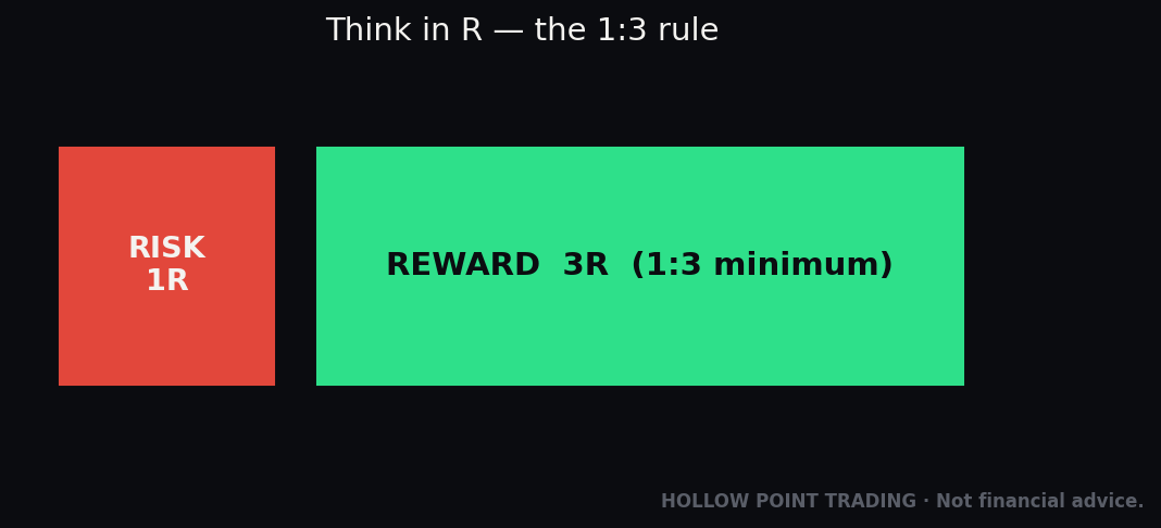
The discipline layer: HPT trades on 1:3 risk/reward and discipline over prediction. Nothing tests discipline like event risk. The temptation to gamble on a number is enormous. But guessing a coin-flip data print isn't trading — it's gambling with a chart open. The disciplined play is almost always to let the event happen, let the knee-jerk fade, and then trade the clean, high-R setup that forms in the aftermath, with the macro wind at your back and a defined stop. You don't need to catch the spike. You need to catch the trend the spike creates. Guessing the number is a 50/50 with a wide, slippage-ridden stop — that's negative expectancy no matter how good your read. Trading the aftermath is a defined-risk setup with the macro and the technicals aligned — that's where the 1:3 lives.
How the Pros Use It Differently From Beginners
The gap between an amateur and a professional around the calendar isn't information — the calendar is public. It's behavior. Same data, opposite approach.
Beginners react. Pros pre-plan. The amateur sees the number flash and decides what to do in the two most expensive seconds of the day. The pro wrote the plan the night before: "If CPI is hot, I'm flat and I look to short tech into the 1H 55 EMA once the spike fades. If it's cool, I look long off VWAP. If it's in-line, I don't trade the morning." The decision is made before the adrenaline hits.
Beginners trade the headline. Pros trade the internals. The amateur reads one number. The pro has the sub-components, the revisions, and the whisper number queued up and knows within seconds whether the headline agrees with the composition.
Beginners predict. Pros position for asymmetry. The pro rarely bets on the direction of a coin-flip release. They bet on the reaction: fading an overreaction, trading the second-move after the fake-out, or standing aside entirely. They're playing the crowd's response to the number, not the number.
Beginners size up into events for the "big move." Pros size down or go flat. The amateur sees event risk as opportunity to swing big. The pro sees it as the moment slippage and gap risk are highest, and reduces exposure precisely when the amateur increases it.
Beginners see the calendar as noise between setups. Pros see it as the setup's environment. To the pro, "there's CPI Wednesday" reshapes the entire week — Tuesday is positioning-light, Wednesday morning is hands-off, Wednesday afternoon is where the week's trend gets born.
Beginners fight the regime. Pros identify it first. Before reading a single chart, the pro answers "what is the market afraid of right now?" and lets that set which prints matter and which way the surprise cuts.
Beginners remember the win. Pros keep a data journal. The professional logs how each print landed vs. consensus and how price actually reacted, building a personal read on the current reaction function — so when the regime shifts, they catch it in the tape rather than reading about it later.
The Common Mistakes
Every one of these has a body count. Learn them from the page, not the P&L.
1. Trading the headline, ignoring the internals. The number that flashes is rarely the whole story. Revisions, sub-components (core, control group, wages, prices-paid), and the composition of the number decide the real move. The screen-scraping algos trade the headline; you have thirty seconds to be smarter than them by reading deeper.
2. Fading the regime. Assuming "good data = stocks up" in a market that's currently trading "good data = no rate cuts = stocks down." Always know which story is priced. Same print, opposite reaction, depending on the regime.
3. Chasing the first spike. The initial move is often algorithmic and frequently reverses. Getting long the first green candle after CPI, then getting stopped on the fade, is a classic. Let the dust settle. The real move often comes 15–30 minutes later.
4. Using a normal stop through a release. Your beautiful 0.5% stop means nothing when price gaps 2% on the number. Either be flat into the event, or size way down and use a stop that accounts for the gap risk — or accept you might get filled far past your stop. Slippage is real and brutal in the release window; stop-losses become market orders and fill wherever the next bid is, which can be miles away.
5. Not knowing what's coming. Getting blindsided by a release you didn't have on your calendar is an unforced error. Check the week's calendar every Sunday, and the day's calendar every morning. There is no excuse for surprise on a scheduled event.
6. Over-trading second-tier data. Not every release is CPI. Trading a violent scalp around consumer sentiment or a regional Fed survey is usually just donating to the spread. Know which events are grenades and which are firecrackers.
7. Ignoring Fed-speak and the blackout window. Assuming the calendar is only about 8:30am data prints. A Chair speech or a hawkish comment from a voter can move price as hard as a data release, and it's not always on the data grid. The unscheduled bomb is the one that gets you, because you weren't watching for it.
8. Forgetting the revision. A "beat" that comes with a big downward revision to prior months is often a worse trend, not a better one. Read the revision before you decide which way the number cut.
9. Confusing importance with surprise-potential. GDP is hugely important but usually low-surprise because it's stale and pre-sniffed. A minor survey can move markets more on a given day because it's unexpected. Importance tells you how much the market cares; surprise-potential tells you how much it will move. Trade the second, not the first.
10. Trading through the event because you "have a strong view." Your conviction about the number is worth nothing — the market has thousands of people with views, aggregated into the consensus, and the outcome is still a coin flip relative to that consensus. A strong opinion on a 50/50 event with wide slippage is a great way to lose money with confidence. Discipline means your view doesn't earn you a gamble.
11. Holding a swing position into a Tier-1 print without deciding in advance. Drifting into CPI or FOMC with a full-size swing because you "forgot" or "didn't want to give up the trend" is how a good week becomes a bad month. Decide before the event whether you hold, hedge, or trim — and size so the gap can't ruin you.
12. Anchoring to the old regime after it flipped. The market's fear changed — from inflation to growth, or vice versa — and you're still trading last quarter's reaction function. This is the most expensive mistake on the list because you'll be systematically wrong on every print until you notice, not just wrong once.
FAQ
Do I have to trade the actual release? No — and usually you shouldn't. The release is the highest-slippage, most-algorithmic, hardest moment of the day. The professional edge is trading the clean setup the release creates 15–60 minutes later, not the whipsaw itself. "No trade during the print" is a completely valid, often optimal, plan.
How far in advance is a number really "priced in"? Positioning builds over the days before a release and intensifies in the final 24 hours. By the morning of a Tier-1 print, the market is fully leaned. That's why an in-line number can still cause a move — the unwind of that positioning happens regardless of surprise.
Why did the market do the opposite of what the data said? Almost always one of three reasons: (1) the surprise was against the headline once you read the internals/revisions, (2) the regime made "good" data bearish (or vice versa), or (3) the move was already priced and you watched a "buy the rumor, sell the news" unwind. Check those three before assuming the market is irrational.
Which single event should a beginner respect most? FOMC and CPI. If you only clear your risk around two things a month, clear it around those. NFP is a close third.
What's the difference between CPI and PCE again, in one line? CPI is the loud, market-moving inflation print; PCE is the quieter one the Fed actually targets, released later and usually already estimable from CPI and PPI. CPI is the fireworks; PCE is the confirmation.
Where do I get a reliable calendar? Any major economic calendar that shows Prior, Forecast, and Actual with an importance rating, and that timestamps releases in your timezone. What matters isn't the source — it's that you check the week every Sunday and the day every morning, and that you know which timezone the times are in (nearly all U.S. data is 8:30am ET).
How do I know which regime we're in? Ask what the market rewards. If cool inflation rips stocks and hot inflation dumps them, you're in the inflation regime. If weak jobs sink stocks (rather than lifting them on cut-hopes), you're in a growth scare. If the market punishes both too-hot and too-cold, it's Goldilocks. The tape tells you — watch how it reacts to the last few prints.
Can technicals be trusted at all around events? Yes — just not during the spike. Levels are suspended in the whipsaw window, then they come roaring back once the trend day starts. Post-event, your EMA stack, VWAP, and key levels are more reliable than usual because a real catalyst just gave the trend fresh conviction.
The Cheat-Sheet: Print This
The core mechanic: Price reacts to Actual vs. Forecast (surprise), with Prior for trend and Revisions for the twist. No surprise = "buy the rumor, sell the news." Size the surprise against normal noise — inside the usual range is mild, outside it detonates.
The reaction shape: spike (0–5s, don't trade) → fade/extend (5s–5m) → digestion (5–30m, real move born) → trend day (30m–close, this is your trade).
The tiering (in a typical regime):
- Tier 1 (grenades — respect fully): CPI, NFP, FOMC + dot plot, Fed Chair speeches / Jackson Hole
- Tier 2 (real movers): Core PCE, PPI, Retail Sales, ISM Services & Manufacturing, GDP Advance, JOLTS
- Tier 3 (context, tiebreakers): Jobless Claims (weekly), Consumer Sentiment/Confidence, ADP, second-tier surveys, Treasury auctions
The timing (ET, U.S.):
- 8:30am — most data (CPI, PPI, NFP, Retail Sales, GDP, Claims, PCE)
- 10:00am — ISM, Consumer Sentiment/Confidence, JOLTS
- 2:00pm — FOMC decision (then 2:30pm press conference)
- Thursday — Jobless Claims (weekly)
- First Friday — NFP (monthly)
- ~10th–15th — CPI (monthly)
- Late August — Jackson Hole
The "which line do I actually read" checklist:
- CPI/PCE → the Core number (ex food & energy), then supercore (core services ex-shelter); discount a shelter-driven beat
- NFP → headline + wages + revisions + unemployment rate + participation (watch the two surveys diverge)
- Retail Sales → the Control Group (back out gas and autos)
- ISM/PMI → is it above or below 50? Plus New Orders, Prices Paid, and New-Orders-minus-Inventories
- Jobless Claims → the 4-week moving average; watch continuing vs. initial
- FOMC → the dot plot and the press-conference tone, not just the rate; diff the statement
- GDP → the price/inflation component and final sales, not just the headline growth
The regime question (ask every week): What is the market afraid of — inflation, growth, or nothing (Goldilocks)? That answer flips which prints are grenades and which way the surprise cuts.
The multi-timeframe rule: 1m–5m = whipsaw, don't trade. 15m–1H = trade the aftermath trend here. 4H–Daily = the catalyst candle confirms or breaks the trend (watch the 55 EMA). Weekly = the regime made visible.
The confluence stack: macro catalyst (calendar) + technical trend (EMA 12/22/55) + level (support/resistance or golden pocket) + order flow (VWAP + volume). When all four agree post-event, that's the A+ trade.
The playbook:
- Know the week's calendar every Sunday. Know the day's every morning.
- Identify the current regime — inflation, growth, or policy? That sets which prints are live.
- Write the if/then plan the night before: if hot → this; if cool → that; if in-line → no trade.
- Into a Tier 1 event: be flat or sized way down. Guessing the number is gambling. Adjust for the volatility regime — wider stops, smaller size, more patience in high-vol tape.
- On the release: don't chase the first spike. Read the internals and revisions. Let the knee-jerk fade.
- After: trade the clean setup the event creates — macro wind at your back, EMA 12/22/55 trend confirmed, VWAP reclaimed, defined stop, 1:3 R/R minimum.
- If there's no clean setup, there's no trade. The calendar tells you when to stand aside, and standing aside is a position.
- Journal how the print landed vs. consensus and how price reacted — build your own read on the current reaction function.
The economic calendar isn't background noise you tune out so you can get back to your charts. It is the chart's environment — the schedule of moments when the market re-prices reality all at once. You don't have to trade every release. You don't have to predict a single number. You just have to know what's coming, what it means, which regime you're in, and how to keep your capital intact while the crowd panics on a print.
Know the schedule. Read the surprise, not the number. Respect the regime. Let the spike fade and trade the trend it leaves behind. That's not gambling on data. That's using it.
Bound by rules, feared by trade.